
Five Essential Properties of Disease Maps
Kirsten M. M. Beyer,∗ Chetan Tiwari,† and Gerard Rushton‡
The past 10 years have seen increased production of disease and mortality maps throughout
the world. Although the spread of these maps exist alongside research on the fundamentals of map design and production, some essential properties of these maps have received relatively little attention, paid specifically from geographers.
These properties include the selection of color schemes, display units, variability of disease rates, brushing techniques, micromaps, and continuous representation. To combat these issues commonly found in disease maps Beyer et. al implemented a method known as adaptive spatial filtering, an adaptive filter of uniform shape that grows inversely with population density for disease rate calculation. In adaptive spatial filtering, a grid is placed over the area. Each grid point is calculated by using a circular filter that expands to obtain observations used in order to calculate stable rates. The user then defines a threshold value to guide the filter bandwidth size (example: expected number of disease events or population size that will result in a stable rate value). The area between grid points is inserted to create a surface representation of a diseased area. The geographic scale of the measured rates of disease vary across the map due to population density and risk of sites. Even though methods such as the census exist, they may not accurately provide data for the use of disease maps. Spatial support for calculation is an important feature of creating accurate disease maps. The differences between age groups, sex and geographical displacement all factor into a population’s susceptibility of disease. Closely related to the control of spatial support is the visual representation of disease. True presentation of disease rates will effectively portray what disease risk patterns look like. Disease maps use bounded measurements, however spatial patterns of risk might actually not follow bounded units. Beyer et. al believe that “risk surfaces are more continuous in nature, varying along with biological, social and environmental characteristics of populations”(Kirsten M. M. Beyer, Chetan Tiwari & Gerard Rushton (2012): Five Essential Properties of Disease Maps). Maps that use bounded units actually prevent the observation of varied risk that might occur in populations. To combat this, Beyer et. al suggest that using an intensity function will represent a continuous surface. On major criticism of disease maps is that defined boundaries remove some spatial details from the map. However, using spatial support methods are in units that are too small to contain enough observations for an accurate calculation in rural areas. By increasing or decreasing the number of filters based on population density, the heterogenous nature of population distribution allows that distribution to guide the spatial detail. Traditionally in the United States, disease mapping is constructed by direct age adjustment, which multiples local disease rates by standard population rates. This is effective when the local area being measured has the same age-sex composition as the standard population. However, when the purpose of the map is to compare different disease rates on local populations, direct adjustment is ineffective. Indirect methods should be applied because it has the advantage of rate stability and maximizes geographic detail reliably for small area populations. Because disease maps should be available to public health practitioners as well as the general public, it’s important that they can be read easily. The scale and color scheme of each map should effetely portray the information in a way that a person without a medical practitioner back ground can understand. 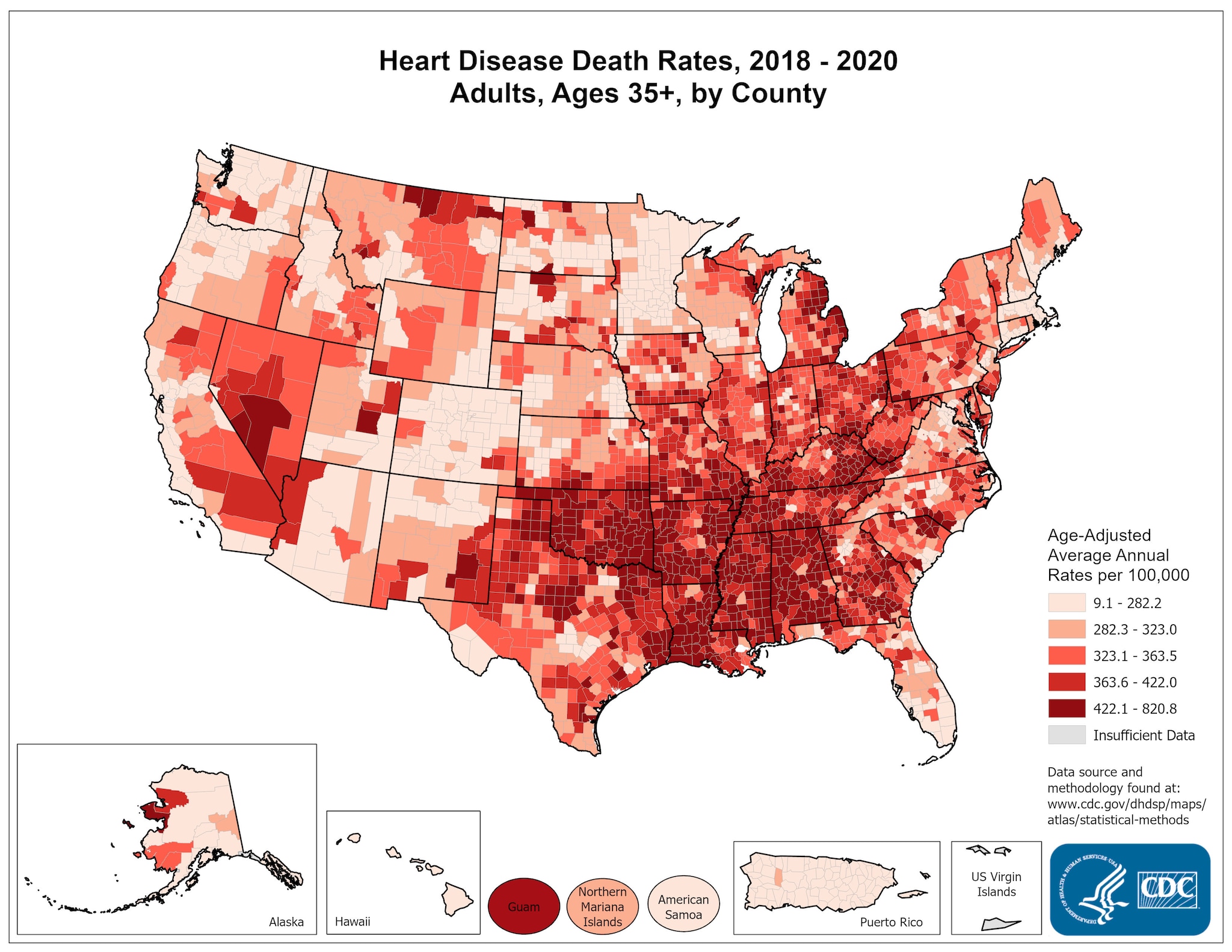
Image from: http://www.cdc.gov/dhdsp/maps/national_maps/hd_all.htm
Kirsten M. M. Beyer, Chetan Tiwari & Gerard Rushton (2012): Five Essential Properties of Disease Maps, Annals of the Association of American Geographers, 102:5, 1067-1075
This is a very interesting map because it makes it appear as if most heart disease occurs in the South. I think it would be interesting to compare this map to one of the types of food, most highly consumed in different areas across America, and to see if there is any correlation between the types of food prevalent in certain areas and how much heart disease occurs within that area.
ReplyDelete