
Beyer, Tiwari, and Rushton developed a five point methodology for creating disease maps:
- Control the population basis of spatial support for estimating disease outbreak rates (Rates of smaller populations aren't as reliable as larger populations because they have a smaller sample size and have more variability).
- Display rates continuously through space (Choosing the best unit of area for the map is essential because it can change the observed spatial pattern of the disease).
- Provide maximum geographic detail across the map (Mapping a rate by a predetermined unit inherently prevents the exploration of the spatial variability within that rate).
- consider directly and indirectly age/sex-adjusted rates (People of Younger or older age may have higher rates than those in their prime, and certain diseases can only be contracted by a certain sex).
- visualize rates within a relevant place context (Larger areas carry more visual weight than smaller ones even though larger areas can be characterized by a low population density and are more likely to have more variable rates).
Beyer, Tiwari, and Rushton realize however that this way of mapping diseases is, in and of itself, imperfect, and that future disease mapping could include statistical confidence to improve the quality of the presented information. Because of the difference in population density future disease mapping can address the potential problem of including information from distant locations or different settings (Urban and Rural).
Beyer, K. M., Tiwari, C., & Rushton, G. (2012). Five Essential Properties of Disease Maps. Annals Of The Association Of American Geographers, 102(5), 1067-1075. doi:10.1080/00045608.2012.659940
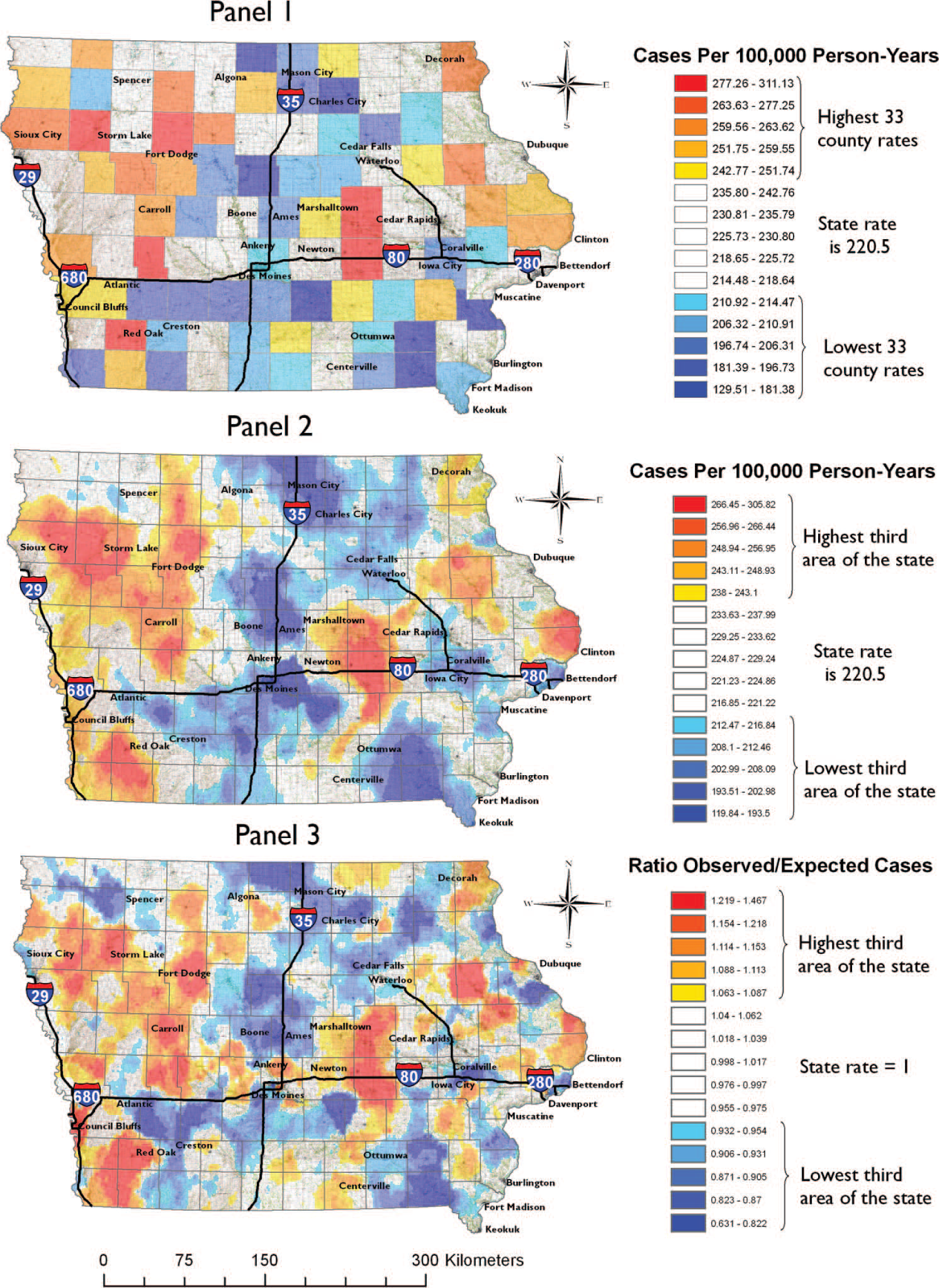
The figure's panel 1 and 2 and really good example of spatial basis that can generate from the use of administrative divisions and the actual mapping of the disease phenomenon. This reminds me of the example I shown you in class about "lying with maps" where Texas may look like the epicenter for tornado activities, but when you look at the isometric as opposed to the choropleth you see that north Texas and Oklahoma are the areas of most Tornado activity. This same problem seems to be occurring here with disease mapping. It is always important when mapping to be critical and look at how you can make misleading maps.
ReplyDeleteI also was reminded of the lying with maps example. Although these maps are extremely educational and important for the public to see, it is vital that the map be accurate and tell the truth about what is going on. I also find it funny to think about the possibility that if everyone in the state saw this map and reacted, they would move to the areas with the least infection and then the map would change. It is based on the human variable.
ReplyDeleteI also thought of people trying to move away from the high density disease areas. Similar to maps that show frequency of natural disasters, no one place is going to be much safer than another; there are simply other types of disasters that are more likely to occur.
DeleteI thought this article was cool because its rules for disease mapping were essentially the same as the rules that we were taught in class about perspective and distortion. Hearing about other people that have been using GIS before us, experiencing the same troubles we are brings things closer to home.
ReplyDeleteI thought it was important that they noted not just the need to have smaller units for better visualization but also to take the size of sparsely populated areas and the effect they can have on the maps visualization. If one was to map based on county, a particularly large rural one could vastly misrepresent the data compared to a smaller higher populated one.
ReplyDelete