
According
to Tom Koch, author of "The Map as Intent: Variations on the Theme of John
Snow," there are two different views of map-making. One side says that
maps are "first and foremeost representative artefacts," while the
other side says that maps are "social documents" and "that
social and conceptual prejudices and perspectives are determining elements in
map-making" (Koch 2). Koch makes it apparent that he agrees with this
second statement. Every map-maker, intentionally or unintentionally, adds bias
to a map to serve their intent. To show this, he analyzes a series of maps
based on John Snow's famous cholera map, which charts instances of cholera
deaths and nearby water pumps and graphically shows a correlation between the
Broad Street pump and a high number of mortalities.

Figure
1: Snow's original map (cropped to show detail)
Snow
was a doctor investigating the source of the cholera epidemic occuring in
London in the Soho area, and this map was part of his research, which theorized
that cholera was a water-borne illness. The map was not definitive proof that
the source of the epidemic was found in the water coming from the Broad Street
pump, and Snow even warned against assuming that there was a direct
relationship between proximity to the pump and the number of cholera deaths
(Koch 3). As part of his research, Snow investigated all instances that did not
correlate with this relationship and found that all people who did not live
near the pump and had died from cholera either had school or did business on or
near Broad Street and were known to drink water from the Broad Street pump. He
also investigated work areas that had really low occurences of cholera near the
Broad Street pump and found that these places had their own private pumps and
that most employees drank from these pumps instead of the Broad Street pump.
Snow's intent was to create "a 'topography of cholera' to summarize a
wealth of data all of which were potentially pertinent to an understanding of
the Soho outbreak" (Koch 12). Important to note is the amount of detail
found on this map. Various local businesses are included, streets vary in
width, each death is marked with a line near that location, and each of 13
pumps is marked with a circle.

Figure 2: Gilbert's 1958 map uses Snow's data to create an entirely new map
E.
W. Gilbert used Snow's data to create his own map in 1958, and included it in
his paper, Pioneer Maps of Health and
Disease in England. He then presented this map as Snow's work, despite the
fact that this map has some obvious differences from the original. Gilbert's
map distorts the representation of the streets by omitting smaller streets and
making the bordering streets larger to frame the area with the highest number
of deaths. Gilbert uses different symbols to represent the data, with dots for
deaths and X's for pumps. The Broad Street pump is located right in the center
of the frame to highlight its importance, and the map represents only 11 of the
13 pumps in Snow's original map, to further highlight the Broad Street pump as
the epicenter of the cholera outbreak. He also neglects to represent the
various buildings and workplaces which Snow investigated as part of his work.
These changes reflect Gilbert's difference in intent. He was not interested in
Snow's process or the entirety of his work. By omitting the details that were
vital to Snow's work, he intended to create a simple map with a simple purpose:
to show Snow as "the man who 'discovered' the cause of cholera through
mapping a single correlation" (Koch 7). His intent was clearly to show
that "maps serve medicine" (Koch 8).
Edward
R. Tufte then takes Gilbert's map, which he refers to as "the famous dot
map of Dr. John Snow," and uses it in his work, The Visual Display of Quantitative Information (Koch 8). He talks
about Snow's map (actually Gilbert's map) as "an early and most worthy use
of a map to chart patterns of disease" (Tufte 24). Again, Snow was not
mapping a pattern of disease, he was merely using a map to visually represent a
part of his research, which did not prove that the Broad Street pump was the
definite source of the cholera outbreak. Tufte's interest was in
"graphical portrayal of data to maximize its utility," and he
intended to show not only that maps serve medicine, but that "the degree
to which they do so depends on the map-maker's clarity of presentation"
(Koch 8). Unfortunately he helped to further distort Snow's original work by
analyzing Gilbert's map instead of Snow's map, and misrepresenting Gilbert's
map as Snow's own.

Figure 3: Monmonier's 1996 map manipulates Gilbert's map to further distort Snow's
original intention
Mark
Monmonier then takes Gilbert's map and distorts it even further in his work, How to Lie with Maps. In this case it is
obvious that the intent was not to create an accurate portrayal of Snow's work,
but to instead show how maps can be manipulated to distort their meaning.
Unfortunately, as in the case of Tufte, Monmonier also refers to Gilbert's
instead of Snow's map. In addition, Monmonier labels his map "Snow's Dot
Map," which when out of context adds yet another map misrepresented as
Snow's. In this map, Monmonier makes all the streets the same size and omits
many of the smaller streets that Snow had included. He changes the symbol for
the pumps into an overly large, exaggerated circle, which further enhances to
importance of the pumps, and in case there is any doubt about the pumps'
importance, Monmonier has a large arrow pointing directly to the Broad Street
pump and labels it as such. The map now shows the Broad Street pump clearly as
the center of the epidemic and makes it the focus of the entire map.

Figure 4: CDC's 2000 map uses a GIS program and alters the data set to even further
distort Snow's map
The
Center for Disease Control (CDC) then takes what appears to be a combination of
the Gilbert and Monmonier maps and distorts the data even further. Now the
streets are represented merely by lines, the pumps are represented by circles,
and that data set has changed. Instead of showing each individual death, this
map shows only one dot per household where many deaths may have occurred. The
map also includes an extra piece of data. A former plague cemetery, which is
thought to have contaminated the Broad Street pump, is now located on the map.
This map was created in a GIS program and again, the intent has changed. The
CDC intends to show that "GIS serves medicine" (Koch 10).
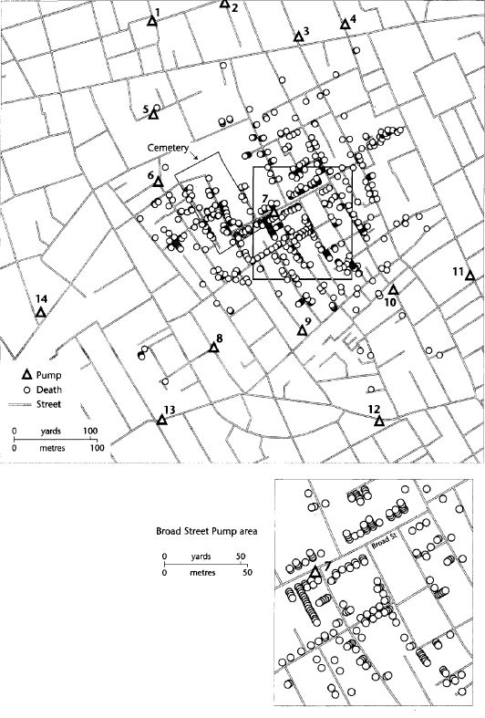
Figure 5: ESRI's 1998 map is more true to Snow's map, but is still missing a lot of
pertinent information from Snow's study
Koch
then turns to another GIS-created map to show that GIS does not inherently need
to alter the data set in order to display Snow's research. In this map circles
are again used to represent deaths and the number of pumps, represented by
triangles, increases to 14. Unfortunately, the streets are all represented as
the same width and none of the buildings are represented as in Snow's original
work. Also, the data is not as visually clear as it was in Snow's original map.
Each
of these maps is visually different, and Koch argues that this is because each
author had a different intent. Each of the maps, other than Snow's, uses
symbols and other visual manipulations to show the Broad Street pump as the
center of the cholera epidemic, while in reality, Snow did not know for sure
that the Broad Street pump was the source of the disease and did not create his
map with the intent of showing it as such. Through the analysis of these
various maps, all based on the same data, Koch concludes, "Map-making is
not a value-free science that somehow stands apart from social, cultural,
economic, and professional prejudices" (Koch 13). Representation of data
and intent are both important to consider both when reading and creating maps.
Koch,
T. (January 01, 2004). The Map as Intent: Variations on the Theme of John Snow.Cartographica:
the International Journal for Geographic Information and Geovisualization, 39, 4, 1-14.
This is interesting to think about, usually maps seem to be more legitimate than other forms of data and statistics, but someone had to make the map, and no one is without prejudice of some kind.
ReplyDeleteIt is interesting that from a academic standpoint certain maps are shows to students throughout their education. From a young age, you perceive that this data is accurate yet it can be represented differently throughout the world. This just shows that one must look carefully at maps and the legends in GIS and keep an open mind to other interpretations.
ReplyDeleteIt is interesting how people generally read maps as true when maps are very much political tools. China actually is counting on people to blindly accept their maps. They've just released a new official map that includes several contested islands in the South China Sea. Though this will unlikely deter the other countries claiming the islands in question, it will be presented to the Chinese public as truth, further aggravating the issue.
Delete