Showing posts with label climate change. Show all posts

Monday, February 17, 2014

Disaster Vulnerability Looks Different for Women

In the case of "natural" disasters, women are more often than not the ones who take the brunt of the impacts following the event. According to the article “The Gendered Nature of Natural Disasters: The Impact of Catastrophic Events on the Gender Gap in Life Expectancy, 1981–2002” written by Eric Neumayer of the London School of Economics and Political Science and Thomas Plümper of the University of Essex and Max-Planck Institute of Economics, women are more vulnerable given social, biological, and economic differences between men and women. 

They define vulnerability as being ‘‘the characteristics of a person or group and their situation influencing their capacity to anticipate, cope with, resist and recover from the impact of a natural hazard”. As opposed to looking to the magnitude of the disaster for their analysis, the authors decided to utilize the number of causalities in a given disaster to better understand the factors at play in widening the gender gap. “The gender gap in life expectancy shows large variations across time and space. Worldwide, on average, women’s life expectancy is 4.69 years higher than that of men. However, in 64 out of 2,266 country-years men actually lived longer than women.” Why is this the case? The authors cite socio-economic standing and the limitations that society places on women as probable causes. 


A few of the compelling reasons that the authors cited for reasons why mortality would be higher for women in disaster include strict dress codes that keep women in clothing that would restrict movement during a disaster, the inability to climb tree or to swim (which many men do as parts of their jobs), and even the fact that many men are allowed to sleep outside during warm evenings on the roofs of their abodes while women remain housebound, regardless. 

Although this article does not include any GIS maps within its text, it provides a number of interesting factors that could be easily represented by utilizing a visualization. By mapping out the elements that are presented within the text, GIS may be used to help predict which areas may need more funding towards educational or adaptation programs based on their vulnerability in terms of likelihood of experiencing a large scale disaster, the female population, and the relative socio-economic classes of the female population. 

The following map “charts how nations stack up on the World Economic Forum’s Gender Gap Index, which gauges the magnitude of the gender gap in four areas: economic participation and opportunity, political empowerment, educational attainment and health and survival. Note that the higher the score, the lower the gap”.


How can society change to make sure that the gender gap is closed and that all people are given the skills they need to survive and thrive with or without facing disasters?


___________________________________________________________________________

Neumayer, Eric and Plümper, Thomas. 2007. “The Gendered Nature of Natural Disasters: The Impact of Catastrophic Events on the Gender Gap in Life Expectancy, 1981–2002” Annals of the Association of American Geographers, 97(3), 2007, pp. 551–566.

Tuesday, February 11, 2014

You Otter Know: Ocean Color Reveals Ecosystem Health


Deforestation. Yes. Stopping deforestation, many people say, is one of the most important things in the world to mitigate climate change. "The trees are like the lungs of the planet," you often hear. But did you know that the world's oceans actually absorb more carbon annually than the world's forests? But little is known about how the oceans' particle size distribution (PSD) varies over time. This is important to understand in order to "assess the contributions made by phytoplankton functional groups to primary production, particle sinking, and carbon sequestration by the ocean.


“Photosynthetic productivity in the oceans’ euphotic zone leads to accumulation of biomass, the fate of which on different spatial and temporal scales determines the biological pump’s role in the global carbon cycle”(Kostadinov et al 2009, 2).


In their paper entitled “Retrieval of the particle size distribution from satellite ocean color observations” published in the Journal of Geophysical Research, Kostadinov, Siegel, and Maritorena of University of California at Santa Barbara explore using Geographic Information Systems (GIS) to project the PSD of the world’s oceans. In order to calculate what the world looks like in terms of Chlorophyll-a (Chl) concentration and PSD the authors utilized three distinct theories/ algorithms: 

To shorten an extremely dense and quite theory heavy article, the authors were modeling which plankton sizes were most represented in which regions of the ocean given that the warmer oceans become, the smaller plankton then results, and, as a consequence, these smaller plankton species absorb less carbon- taking less carbon to the bottom of the ocean when they die. The below image represents particle size of varying microplankton particles which is represented by backscattering(physical reflection of the particles). 

There were many more maps within the document to show that there are many zones in the ocean, particularly smaller particle sizes. Want to read it for yourself? You asked for it: 

"Picoplankton-sized particles dominate total particle volume in the subtropical gyres where they contribute 60 to nearly 100% of the total particle volume (Figure 11b). Nano-sized particles are prevalent in transitional, upwelling, coastal and higher latitude regions and their maximum contribution is about 50%, which occurs over a significant fraction of the oceans (Figure 11c). Microplankton-sized particles contribute up to 50 – 60% of the volume concentration only in regions known for their high productivity, such as coastal areas, the North Atlantic bloom region, the Equatorial and Eastern Boundary Current Upwelling zones, and higher latitude zones (Figure 11d). Abundances of microplankton-sized particles are extremely low in the subtropical gyres and much of their transition zones (Figure 10d). Thus their percent contribution to the volume concentration is virtually zero in these areas"(Kostadinov et al 2009, 11).

What does this look like? This: 
 And this:


Conclusion? Protect the ocean: mitigate your carbon emissions, and don’t use chemicals that will harm our waterways or the ocean will cease to take our extra carbon from the atmosphere and will begin to eat away the coastlines. 

DO IT. 

         PLEASE. JUST DO IT. 

Sources: 

Validanov et. al. 2009. “Retrieval of the particle size distribution from satellite ocean color observations” JOURNAL OF GEOPHYSICAL RESEARCH, VOL. 114, C09015, doi:10.1029/2009JC005303

Monday, February 3, 2014

De-railed by Climate Change: Public Transportation & Sea Level Rise


There are many more consequences resulting from Climate Change beyond ecological devastation and increasingly strong super-storms. One such consequence occurs each passing day. Little by little the Earth’s ocean levels are rising, resulting in many possible floods zone in and around coastal areas. This means that coastal communities are at high risk for future inundation. In their article “Identifying Sea Level Rise Vulnerability using GIS: Development of a Transit Inundation Modeling Method” Oswald and Treat utilize Geographic Information Systems (GIS) to make models of communities whose transit would be the most impacted by future potential flooding. Their study uses Philadelphia’s transit system (which includes both busses and trains) as a case study for their Transit Inundation Modeling Method (TIMM) considering that this large city lies on the side of the Delaware river. 

“TIMM is based on a five-step process that can be applied to transit agencies to identify vulnerabilities. The process is repeatable, straightforward, GIS- based, and uses publicly available geographic data. The five steps include: (1) Define Study Area, (2) Gather Data, (3) Create Inundation Layers, (4) Analyze Data, and (5) Synthesize Results and Recommendations”(Oswald 2013, 3). According to the Intergovernmental Panel on Climate Change (IPCC)’s 2007 report, “these levels will increase between 0.18 to 0.59 meters over the next 100 years... Furthermore, current IPCC data compared to predicted values show that these predictions may be underestimated (Rahmstorf et al, 2007). Worst case scenario values include a 5.0 meter increase of world sea levels due to catastrophic collapse of the Antarctic ice sheets (Vaughan, 2006)”(Oswald 2013, 2).

The given predictions by the IPCC indicate a key vulnerability to be added into the data section of the TIMM. Taking this information into account and layering geo-referenced historic maps of Philadelphia’s transportation systems, the authors were able to create maps modeling the impact of climate change on Philadelphia’s public transportation system.  


One such concern highlighted in this study was exemplified by the aftermath of Hurricane Sandy which flooded most of the Northeastern United States. In New York City, there was a massive amount of flooding specifically in the Subway system. Oswald and Treat cite that “In particular, since railways are often located in low-lying areas, they are specifically at-risk to flooding of underground tunnel and rail tracks, erosion of the rail base, and reduced clearance under bridges”(Oswald 2013, 2). As seen on the map below, this concern is relevant to Philadelphia’s extensive rail routes.


After utilizing GIS, Oswald and Treat strongly recommend that Philadelphia adapt a TIMM to best predict which areas of transit are at the highest risk for inundation and for those areas to be granted adaptation plans that would allow for necessary changes to be made to transit systems before climate induced disasters and gradual flooding. 

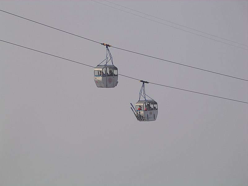
Perhaps it’s time to start investing in city gondola lifts! 

http://upload.wikimedia.org/wikipedia/commons/thumb/c/cd/Gondola_lift_lucerne_2006.03.18.jpg/800px-Gondola_lift_lucerne_2006.03.18.jpg


Oswald, M. R., & Treat, C. C. (2013). Identifying Sea Level Rise Vulnerability using GIS: Development of a Transit Inundation Modeling Method. International Journal Of Geoinformatics, 9(1), 1-10.

Monday, January 27, 2014

The Future of Greenland's Ice Sheet

Widely publicized in the Summer of 2012 was an extreme example of global warming: 97% of Greenland’s ice sheet indicated surface melting for a few days of July (Tedesco et. al 2012). This was one of the most startling shows of a vastly changing climate apart from super-storms attributed to climate change (think Hurricane Katrina in 2005). “But- isn’t there always going to be melting ice in the summer?” you may ask. Well, yes. BUT- the important thing to note is the multivariable indicators: melting, run-off, mean surface melt, refreezing, and albedo. The great melt of 2012 is an indication that the world is entering into a new stage of warming, one that is accelerating and more aggressively altering how we understand our climate. 

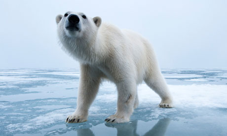
Cue picture of sad polar bear whose eyes, calling out for help, bore deep into your soul:

So then, what does the future look like for Greenland’s ice sheet? The answer: complicated and not very good. 

In the article “Greenland Surface Mass Balance as Simulated by the Community Earth System Model. Part II: Twenty-First-Century Changes” written by Miren Vizcaíno  (Department of Geography, University of California, Berkeley, Berkeley, California, and Institute for Marine and Atmospheric Research, Utrecht University, Utrecht, Netherlands), William H. Lipscomb (Group T-3, Los Alamos National Laboratory, Los Alamos, New Mexico), William J. Sacks (National Center for Atmospheric Research, Boulder, Colorado), and Michiel van den Broeke (Institute for Marine and Atmospheric Research, Utrecht University, Utrecht, Netherlands), an analysis of past melting on Greenland’s ice sheet is used to create a model predicting future changes to the surface mass balance. 

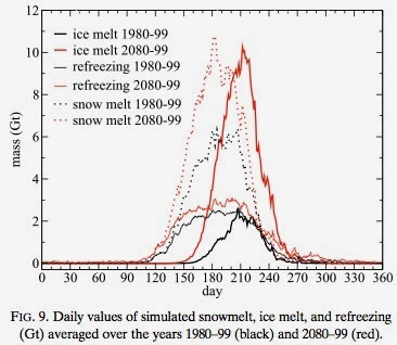
According to their modeling, there are some key changes to the elements that have maintained the surface mass balance (SMB) of the Greenland ice sheet that we know and love. To define this concept, SMB is defined as the net balance between accumulation (of snow/ice) and ablation (any method of snow/ice removal ex: melting, evaporation, sublimation, calving, etc.) on the surface of any glacial body. In the case of Greenland, ablation is projected to be greater than accumulation, resulting in a net loss of surface ice. Given the complexity of the article, I will break it down by explaining each component of the images below. 


Albedo is the reflection coefficient that is used to determine reflecting power. Lowering albedo indicates increased melting, which according to this graphic is the future projection for Greenland’s ice sheet. "Some of the processes driving changes in albedo are snowfall and rainfall events, snow temperature, the occurrence of melt, and exposure of bare ice. These changes have a large impact on the local climate and the amount of energy that is available for melt"(Vizaiíno 2014)

According to the article, there will be an increase in rainfall by 15-26%. Meanwhile, precipitation in the form of snow will increase slightly as well, but only onto part of the surface. This will lead to increased runoff. 

While precipitation increases, refreezing increases only slightly. The ratio of refreezing to available liquid water drops from 35% in 1980–99 to 21% in 2080–99. This means that there will not only will there be increased melting, but there will also be more precipitation contributing to run-off and melt. 


This means that "Precipitation rates increase by 18% but surface melting and runoff increase more (215% and 266%, respectively). The ratio of refreezing to total available liquid water (i.e., the sum of melt and rainfall) decreases from 35%–21%"(Vizcaiíno 2014).

According to a combination of all of the factors shown above, Vizcaíno et. al project that the number of melt days will increase by 89%, meaning that 57 days will see significant melting each year. And given the projections above, you already know how much of this liquid will not return to its solid state come Winter. This melting would contribute to a net sea level rise of over 5cm. 

My suggestion? Move inland. 

_ _ _ 

Tedesco, M.,  X. Fettweis, T. Mote, J. Wahr, P. Alexander, J. Box, and B. Wouters. 2012. Evidence and analysis of 2012 Greenland records from spaceborne observations, a regional climate model and reanalysis data. The Cryosphere Discuss., 6, 4939–4976, doi:10.5194/tcd-6-4939-2012.

Vizcaíno, M., Lipscomb, W. H., Sacks, W. J., & van den Broeke, M. (2014). Greenland Surface Mass Balance as Simulated by the Community Earth System Model. Part II: Twenty-First-Century Changes. Journal Of Climate27(1), 215-226. doi:10.1175/JCLI-D-12-00588.1