Wednesday, January 29, 2014

Volunteered Geographic Information in the Social Cyberscape
 

Fischer’s article from last Spring in Geo-Informatics breeches a subject that most if not all modern Americans have encountered in one form or another: data-driven consumer-focused advertising.  Particularly, Volunteered Geographic Information, or VGI for short, has become a common source for geodemographic data that sites like Amazon, Google Places, Facebook Places, Yelp, Twitter, and other applications utilize in order to expedite crowdsourcing at a reduced price in the ongoing maintenance of their datasets.  


VGI falls under the umbrella term “Big Data.”  Big Data refers to a collection of information that is collected from a large number of sources (think one-billion plus Facebook users) and depending on the analytic technique, the permutations of data are processed for various commercial uses by corporations.  Uses are derived from the source person's habits of behavior, and other seemingly mundane tidbits of information.  As the technology for analyzing this complex data improves, so does its value.  Crawford and Boyd point out, “…VGI becomes a commodity as its social patterns of production are analyzed and applied for social and economic decision-making processes and the data-driven mass customization of goods and services.”  In other words, a world of large-scale personalized advertising grounded in an individual consumer’s behavior. 
The potential uses for VGI is still an open frontier, as well as the nature of how “voluntary” it truly is.  The authors mention that some GIS practitioners remain skeptical of the data’s reliability relative to the accuracy and credibility from which these essentially unregulated sources are pulled.  In Crawford and Boyd’s words, “VGI is a biased source of information which is produced by interest-specific communities and their conceptions of space,” and later, “VGI datasets hardly allow for a reliable interpretation of who and what the analysis represents, let alone a generalization.”
            As mentioned in passing above, the voluntary nature of VGI is dubious when juxtaposing users’ perception of data with data collection agencies’.  Where a user might give Google+ permission to share their location with friends in their social circle, this simultaneously allows Google to track the venues and habits of one’s movements in a decontextualized manner with emphasis on data collection rather than human collaboration.
            Ultimately, for VGI data, Fischer claims, “…the challenge to engage with networked geo-communication as a whole and how people construct meaning from the use of geomedia, denotes an approach towards a social theory of geographic information.”  This harkens to the interpretation that GIS is not merely a technological means towards furthering Big Data-driven profits, but an interactive medium whereby informed users can deepen their understanding of the topographical relationships around them while navigating a socially significant medium with others.     

Fischer, Florian. (2012, April-May).  A New but Delicate Data-Source: VGI as Big Data.  GeoInformatics, 15(3), 46-47.

Accessed here: http://fluidbook.geoinformatics.com/GEO-Informatics_3_2012/#/1/

Mapping Conflict


One of the primer uses of Geographic Information Systems is to take complex data sets and turn it into a visually easy map to understand.  Because the tool is so multifaceted it can be used for environmentalist, community planners, politicians, and everyone in between; everyone needs a map of some sort.  For instance, the military has started using GIS technologies to map out safe and unsafe zones in Iraq in order to better apply American resources.  
Richard M Medina (Department of Geography and GeoInformation Science, George Mason University), Laura K Siebeneck (Department of Public Administration, University of North Texas), and George F Hepner (Department of Geography, University of Utah) compile some of this information in “A Geographic Information Systems (GIS) Analysis of Spatiotemporal Patterns of Terrorist Incidents in Iraq 2004–2009” (2011).  
Data collected came from the U.S. National Counterterrorism Center’s (NCTC) Worldwide Incidents Tracking System (WITS) online database and contained 22,805 Iraqi incidents between January 1 2004 and December 31 2009.  This database defined attacks as “incidents in which subnational or clandestine groups or individuals deliberately or recklessly attacked civilians or noncombatants” (865, 2011).  Of the 22,805 incidents 98.6 percent of them could be located with GIS and were turned into a shapefile (865, 2011).  Maps were then created based on a six month basis (Jan-June, July-Dec) in order to show a temporal aspect.  Attack intensity for an area was then defined as the sum of fatalities, injuries, and hostages divided by the total number of incidents.


Medina, Siebeneck, and Hapner first mapped out the total attacks and locations


Then by overlaying the intensity of the attacks, as “ one large attack with many casualties will be much more damaging than 100 small casualty-free attacks” the most concerned areas will be highlighted.


A temporal effect then be created by setting maps beside each other separated by 6 month time periods.  


Some districts do stand out, namely; Bayji, Tikrit, Samarra, Balad, and Ar Ramadi.  Moreover, some patterns can be seen in how the violence escalated and moved somewhat southeast.  It is also important to understand terrorism as a tool to inspire the most fear and to be predominantly occurring in recreational places (Bali bombings), symbolic meanings (US World Trade Center), or civilian areas (like trains or hotels) (863, 2011).  A timeline of important events can also be ued as a tool in understanding the pattern of attacks.


Medina, Siebeneck, and Hapner conclude with 4 bullets of analysis:


“(1) attacks correlate with population variables while intensities do not;
(2) both number and intensity of attacks should be considered to find priority areas;
(3)attack patterns are variable over time; and
(4) social, political, and cultural triggers that drive terrorist activity can be identified.”


While the data set contains over 20,000 incidents a GIS map can be made to show the areas of most concern that threaten human life while the raw data itself is far too overwhelming.  GIS is a tool that makes maps, and some of those maps can be used to save lives.


Tuesday, January 28, 2014

Estimation of fuel moisture content towards Fire Risk Assessment: A review


Verbesselt, J., Fleck, S., & Coppin, P. (2002) Estimation of fuel moisture content towards Fire Risk Assessment: A review. Forest Fire Research & Wildland Fire Safety, Vlegas (ed.). Millpress, Rotterdam, 1-11

Growing up we’ve all heard the phrase “only you can prevent forest fires” from the iconic Smokey the Bear warning about the dangers of reckless behavior in campsites and along hiking trails. A team of three scientists took Smokey’s words to heart as they tackled how fires really can be prevented.

In “Estimation of fuel moisture content towards Fire Risk Assessment: A review”, Verbesselt, Fleck, and Coppin investigate the probability of vegetation igniting based on the fuel moisture content (FMC). They argue that by analyzing the moisture content in vegetation, estimates can be drawn as to what areas of land would most likely catch on fire. With these estimates, preparations can be made to prevent the ignition of vegetation as well as stopping the spread if caught on fire.

To investigate, Verbesselt et al. used both optical and thermal remote sensing. For optical remote sensing, estimations were made to identify the water content from variations in a leaf. Thermal remote sensing identified how much water is evaporated from a leaf. They achieved this by looking at atmospheric correlations, energy resistance models, as well as the climate and surface variables. 


In the graph above, Verbesselt et al. plotted the relationship between the surface temperature and the NDVI (measurement to see if vegetation is dead or not). The graph removed variables such as clouds and areas of water which could have heavily skewed the results. Vegetation like that of a grassland got to very high temperatures with very little NDVI whereas open forests clumped with a moderate surface temperature and high NDVI.

The results were reflected by the data: vegetation with shallow root systems and scattered placement (grasslands) were more likely to show the FMC to ignite than vegetation with deep root systems and clumped placement (forests). Be that as it may, Verbesselt et al. concluded that variables such as time of day, weather and climate could effect the probability of vegetation igniting. 
  
Based on the article, this could potentially be used to fine tune the preservation of natural parks, protected lands, agriculture as well as residential areas. Smokey really was right saying that prevention is the key to stopping forest fires...and a little mapping. 


Monday, January 27, 2014

Fire in the Brazilian Amazon

Fire in the Brazilian Amazon: A Spatially Explicit Model for Policy Impact Analysis 

Arima, Eugenio. Simmons, Cynthia. Walker, Robert. Cochrane, Mark. Fire in the Brazilian Amazon: A Spatially Explicit Model for Policy Impact Analysis. JOURNAL OF REGIONAL SCIENCE, VOL. 47, NO. 3, 2007, pp. 541–567. https://lms.southwestern.edu/file.php/5760/Literature/Arima-2007-Fire_Brazilian_Amazon.pdf


This article was about fires in the Amazon having an effect on the prices of beef and soy. The more fires there were, the higher beef and soy prices raised. However, the article "implements a spatially explicit model to estimate the probability of forest and agriculture fires in the Brazilian Amazon." These researchers focused on the environmental destruction and effects of these wild. They also took into account how infrastructure effected wild fires. They found that the more roads and other infrastructure that was built, the less farmers slash and burn techniques were taking its toll on the environment. 


The conducted multiple simulations and to predict future fire vulnerability in the Amazon. Their results led to public policy implementations because they found that the occurrence of fire was highly correlated with economic variables. 

I got excited when I saw this picture because it looked like the first map we made in class. I like seeing it applied in the real world. This was a basic map of the regions that fires were most susceptible to.   

Assessment of biomass potential for power production: a GIS based method.


This paper presents a method which estimates the potential for power production from agriculture residues. This system, a decision support system (DSS), identifies the geographic distribution of economically accessible biomass potential. Using a four level analysis to determine theoretical, available, technological and economically exploitable biomass, DSS incorporates potential restrictions and potential power plant sites.
Biomass resources include wood residues, agricultural residues, agro-industries and animal farms, energy crops and municipal solid waste. These elements are identified using a procedure which locates bioenergy and estimates a minimum area necessary for biomass collection. Electricity production cost is used in the identification of these sites.
 Additionally the DSS system is applied towards the island of Crete as a case study. This analysis highlights the decision-making component of the GIS system. Furthermore, a significant biomass potential exists that could be economically and competitively harvested. The main factors which affect the economic feasibility of a potential site are plant capacity and spatial distribution of the available biomass.
This model has proven valuable towards directing active involvement of energy companies and increasing contribution of biomass to the energy system.


---
Voivontas, D., Assimacopoulos, D., & Koukios, E. G. (2000). Assessment of biomass potential for power production: a gis based method. Biomass & Bioenergy20, 101-112. Retrieved from http://environ.chemeng.ntua.gr/en/Uploads/Doc/Papers/Renewable Energy/2001_Assessment of biomass potential for power productio.pdf

The Future of Greenland's Ice Sheet

Widely publicized in the Summer of 2012 was an extreme example of global warming: 97% of Greenland’s ice sheet indicated surface melting for a few days of July (Tedesco et. al 2012). This was one of the most startling shows of a vastly changing climate apart from super-storms attributed to climate change (think Hurricane Katrina in 2005). “But- isn’t there always going to be melting ice in the summer?” you may ask. Well, yes. BUT- the important thing to note is the multivariable indicators: melting, run-off, mean surface melt, refreezing, and albedo. The great melt of 2012 is an indication that the world is entering into a new stage of warming, one that is accelerating and more aggressively altering how we understand our climate. 

Cue picture of sad polar bear whose eyes, calling out for help, bore deep into your soul:

So then, what does the future look like for Greenland’s ice sheet? The answer: complicated and not very good. 

In the article “Greenland Surface Mass Balance as Simulated by the Community Earth System Model. Part II: Twenty-First-Century Changes” written by Miren Vizcaíno  (Department of Geography, University of California, Berkeley, Berkeley, California, and Institute for Marine and Atmospheric Research, Utrecht University, Utrecht, Netherlands), William H. Lipscomb (Group T-3, Los Alamos National Laboratory, Los Alamos, New Mexico), William J. Sacks (National Center for Atmospheric Research, Boulder, Colorado), and Michiel van den Broeke (Institute for Marine and Atmospheric Research, Utrecht University, Utrecht, Netherlands), an analysis of past melting on Greenland’s ice sheet is used to create a model predicting future changes to the surface mass balance. 

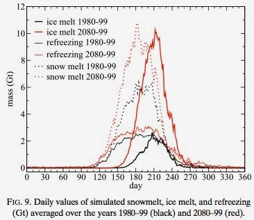
According to their modeling, there are some key changes to the elements that have maintained the surface mass balance (SMB) of the Greenland ice sheet that we know and love. To define this concept, SMB is defined as the net balance between accumulation (of snow/ice) and ablation (any method of snow/ice removal ex: melting, evaporation, sublimation, calving, etc.) on the surface of any glacial body. In the case of Greenland, ablation is projected to be greater than accumulation, resulting in a net loss of surface ice. Given the complexity of the article, I will break it down by explaining each component of the images below. 


Albedo is the reflection coefficient that is used to determine reflecting power. Lowering albedo indicates increased melting, which according to this graphic is the future projection for Greenland’s ice sheet. "Some of the processes driving changes in albedo are snowfall and rainfall events, snow temperature, the occurrence of melt, and exposure of bare ice. These changes have a large impact on the local climate and the amount of energy that is available for melt"(Vizaiíno 2014)

According to the article, there will be an increase in rainfall by 15-26%. Meanwhile, precipitation in the form of snow will increase slightly as well, but only onto part of the surface. This will lead to increased runoff. 

While precipitation increases, refreezing increases only slightly. The ratio of refreezing to available liquid water drops from 35% in 1980–99 to 21% in 2080–99. This means that there will not only will there be increased melting, but there will also be more precipitation contributing to run-off and melt. 


This means that "Precipitation rates increase by 18% but surface melting and runoff increase more (215% and 266%, respectively). The ratio of refreezing to total available liquid water (i.e., the sum of melt and rainfall) decreases from 35%–21%"(Vizcaiíno 2014).

According to a combination of all of the factors shown above, Vizcaíno et. al project that the number of melt days will increase by 89%, meaning that 57 days will see significant melting each year. And given the projections above, you already know how much of this liquid will not return to its solid state come Winter. This melting would contribute to a net sea level rise of over 5cm. 

My suggestion? Move inland. 

_ _ _ 

Tedesco, M.,  X. Fettweis, T. Mote, J. Wahr, P. Alexander, J. Box, and B. Wouters. 2012. Evidence and analysis of 2012 Greenland records from spaceborne observations, a regional climate model and reanalysis data. The Cryosphere Discuss., 6, 4939–4976, doi:10.5194/tcd-6-4939-2012.

Vizcaíno, M., Lipscomb, W. H., Sacks, W. J., & van den Broeke, M. (2014). Greenland Surface Mass Balance as Simulated by the Community Earth System Model. Part II: Twenty-First-Century Changes. Journal Of Climate27(1), 215-226. doi:10.1175/JCLI-D-12-00588.1


Social Construction of GIS in China's Changing Urban Governance

Wen, L., & Ghose, R. (2010). Social Constructions of GIS in China's Changing Urban Governance: The Case of Shenzhen. Cartographica45(2), 89-102. 

In "Social Constructions of GIS in China's Changing Urban Governance: The Case of Shenzhen," the two authors attempt to fill a gap in scholarly GIS literature by researching a case study of the role GIS plays in non-Western nations. Wen and Ghose investigate the ways in which territorial conditions and interrelations between organizational and city boundaries influence governmental GIS development in the city of Shenzhen, China. This study, while looking at the role of GIS development in non-Western contexts, also reveals relationships between various Chinese bureaucracies and the development of "digital cities" engendered in response to the recent digital revolution. 


 Because of the Chinese government's centrally planned system, the Ministry of Construction is viewed as an important organization that plays a role in guiding local municipal governments to develop information technology (IT) infrastructure, including GIS. Municipal governments consider it an "honor" to work with the central authorities in developing and pursuing strategic goals, and the Figure above represents the relationship between the Ministry of Construction and the cities selected to participate in the Experimental Digital Urban Management City project. The project was promoted as a model of digital urban management for local municipalities. The Shenzhen portion of the project was funded by the city itself, estimated at a price around $16 million USD. 

Though central authorities are primarily responsible for setting the goals of the project, it is largely the responsibility of local city-level organizations to come together to make these goals a reality. The development of Shenzhen's spatial information platform was largely influence by city-level actors, giving the centrally-planned project legitimacy in the eyes of local leaders. However, one of the conclusions by the authors is "the State still holds a dominant and hegemonic position for geographic knowledge production in the process of developing GIS and governing the urban population." 

In large part, this study is a foray into the development of GIS and geographic data in non-Western contexts, and provides the opportunity for future GIS scholars to research the relationship between state and local power in geographic knowledge development. Understanding these relationships is important because it may compromise the quality and accuracy of geographic information that is officially collected and published. 

“Where do you bank your cash?”


Cover, J., FUHRMAN SPRING, A. M. Y., & GARSHICK KLEIT, R. A. C. H. E. L. (2011). Minorities on the Margins? The Spatial Organization of Fringe Banking Services. Journal of Urban Affairs, 33(3), 317-344.

Some people may use a traditional bank or a credit union. Others may visit an alternative financial service provider (AFS) for banking services; AFS are pawnshops, payday lenders, check cashers, and car title loans. Minorities are the main users of AFS, which brings accusations that AFS are specifically targeting minorities.

In their study, Cover et al. (2011) research if AFS are targeting minorities by using spatial modeling, bivariate testing, and multivariate regression. Four case studies are used for the analysis: Boise-Nampa, Idaho, Yakima, Washington, Rapid City, South Dakota, and Waterloo-Cedar Falls, Iowa. The researchers choose small metropolitan areas because they have fewer banking options. Furthermore, the areas where specifically chosen because of their demographic makeup; Boise is a medium-size metro area and is about 11% Hispanic; Yakima is 41% Hispanic, Rapid City is 9% Native American; Waterloo is 6% African-American. 


After choosing the metro areas, Cover et al. (2011) used GIS spatial modeling to map out the racial composition, neighborhood income, and commercial activity for each city. Data was obtained from the U.S. Census Bureau, Federal Deposit Insurance Corporation, Credit Union National Association, and Reference USA.


GIS mapping reveals that AFS are highly concentrated in Hispanic and Native American neighborhoods in Boise, Yakima, and Rapid City; however, black neighborhoods in Waterloo contained less AFS than the other metro areas in this study. As for poverty and AFS, spatial modeling indicates no clear pattern of poverty and AFS concentration for Boise and Rapid City: banks and AFS are more evenly distributed. In Yakima and Rapid City, AFS and poverty are in the same areas. In neighborhoods with AFS, poverty tends to be higher. It seems as if AFS are targeting poor neighborhoods and minorities, but this not the whole story.  

Using multivariate analysis, Cover et al. (2011) were able to hold individual neighborhood characteristics fixed and determine which variable has the greatest effect on AFS location. The only problem with using multivariate regression for this project is that the sample size is too small, which restricts the number of variables to be used in the model. A poisson regression of count of AFS providers was used to determine which variable influences AFS location the most; independent variables include number of banks/credit unions, number of businesses, population, percent urban, percent of people who are 200% below the poverty line, and minority concentration. The results indicate that commercial activity, concentration of Hispanics, and neighborhoods with moderate poverty are statistical significant from zero and all three variables have a large effect on AFS location.


Cover et al. (2011) offer some explanations on their findings. First, AFS and banks tend to locate in areas that zoned for commercial activity; hence the reason why business activity influences where an AFS locates because that is where customers go to shop and spend money. As for Hispanic neighborhoods, AFS locate in those areas because Hispanics lack access to traditional banking services. Boise and Yakima are agricultural communities, and the Hispanics working in those cities may be undocumented workers. Therefore, undocumented workers do not have the prerequisites to open a bank account, such as identification or minimum account balances. When it comes to poverty, AFS locate in neighborhoods with moderate poverty because those areas have the need for such services. Areas with high poverty are not attractive to AFS since those individuals lack the income to obtain and repay such services.

This study can be used to provide traditional banking services to low-moderate-income households. More research should be done on larger metropolitan areas since this would increase the sample size. It may be that the market fails to provide traditional banking services to certain segments of the population.  

Elevation Data and it's Uses Regarding Floods


Gesch, D. (2005). Topography-based analysis of hurricane katrina inundation of new orleans. Science and Storms:the USGS Response to the Hurricanes of 2005, 53-56.        

https://lms.southwestern.edu/file.php/5760/Literature/USGS-2005-Katrina.pdf

To think of elevation data, just picture the information itself that goes into making a topography map. This information can be obtained in many ways, at least two of which were used in New Orleans during hurricane Katrina. Light detection and ranging (lidar) remote sensing is useful in lower, flatter areas, shedding light to the smaller details other methods might miss. Lidar has become standard use in mapping industries and the government is increasingly utilizing this method.


During Katrina, aerial pictures of flood areas were not possible yet. Instead, U.S. Geological Survey (USGS) Office of Surface Water used a measure of the water level on Lake Pontchartrain, assuming the flood had leveled out, then compared it to lidar data collected a few years before. 


This combination of data systems produced inundation estimates of depth and volume of the flood that allows for a "history of flooding and water removal" to be created. The long and the short of it is, with this information, damages from future floods can be lessened. The effects on certain buildings would be understood, allowing for either fortification or restructuring. And in city planning this would be useful to know where certain measures are needed to improve the infrastructure of the city.

So, essentially, the difference between choosing this home for a likely flood zone or...


choosing this. Which one would be safer? Notice the flood lines halfway up the windows, before choosing.


Another benefit is the experience and ability gained through this technique that will allow experts to provide timely inundation maps for emergency response purposes.

Varying Solar Radiation Effects on Agriculture and Forestry

Fu, P., & Rich, P. M. (2002). A geometric solar radiation model with applications in agriculture and forestry. Computers and electronics in agriculture37(1), 25-35.


                 It is well known that sunlight is a necessary component of successful plant growth, along with water and nutrients. Few know that the temperature of the soil also has an effect on many biophysical processes. There is little information on how solar radiation actually affects the soil temperature and even less on how elevation affects the temperature of the soil. So in the study, Fu and Rich looked at a 300 km2 patch of land near the Rocky Mountain Biological Laboratory, in Colorado, USA. This area had varying elevations, which made it perfect for determining if elevation has any effect on the soil temperature. Before the start of the study, eleven soil temperature sensors were buried with which temperature readings were registered once an hour. However, only 7 of these sensors were fit to use at the end of the study. 

                 After roughly a year, the sensors were retrieved and their information downloaded. With this information, as well as information gained from local weather stations, a map could be generated that showed the relative relationship between elevated areas and temperature of the soil. To achieve this, daily temperature values were averaged to create temperature ranges. 

                 At the conclusion of the study, Fu and Rich discovered that a few variables led to errors in their data. For example, sensor placement had a small effect on the temperature recorded by the sensor. Additionally, the amount of vegetation cover above the sensor would obviously affect the temperature of the soil. And finally, the quality of the software that created the final maps had a few issues that could have led to inaccuracies in the maps. Overall, Fu and Rich found that the higher the elevation, the lower the temperature of the soil. They also determined that to have a more accurate map, far more sensors would have to be used.  In this instance however, GIS created an adequate map that shows the relationship between the elevation of an area and the temperature of the soil. 

Matthew Innes Post #1


Geographical Information Systems (GIS) as a Simple Tool to Aid Modeling of Particulate Waste Distribution at Marine Fish Cage Sites
From the amount of farmed raised fish that flow in and out of grocery stores and restaurants, there must be one that causes food poisoning? Well this could be due to high levels of organic matter within the large pools that the fish come from. In this article, carbon settling at the bottom of the large tanks in the form of uneaten food and fecal matter is brought to the forefront of the conversation through using GIS technology.
This interesting article from O. M. Perez, brings in old formulas that help calculate carbon distribution within and around the tanks. Perez uses these formulas to calculate the numbers that are then applied with GIS to come up with some highly informative graphs and diagrams.


These two graphs show the distribution of carbon within one tank on the property of a fishery. These graphs help fishery owners begin to realize why some of their fish are losing them money and then harm the buyer with possibly contaminated fish.

By using the formulas that are presented in the article these graphs are formed and help environmentalists to change the ways of filtering and help them begin to theorize about new ways to grow the farm raised fishery business. At the end of this article however Perez brings us back to reality and tells us how this technology is still not sufficient enough to change the world with just a few examples. This lack of using technology especially GIS technology is holding new ways of production back and should be changed just how Perez is emphasizing. 

O.M. Perez, T.C. Telfer, M.C.M. Beveridge, L.G. Ross (20 November 2000). Geographical Information Systems (GIS) as a Simple Tool to Aid Modelling of Particulate Waste Distribution at Marine Fish Cage Sites. Retrieved from: http://www.sciencedirect.com/science/article/pii/S0272771401908704