Thursday, February 23, 2012

Evaluation of Spatial Relationships between Health and the Environment: The Rapid Inquiry Facility


Linda Beale, Susan Hodgson, Juan Jose Abellan, Sam LeFevre, Lars Jarup

Environmental public health systems have recently taken much interest into the adoption of a tool used for evaluating spatial relationships between health and environmental risk factors. The Center for Disease Control’s (CDC) program, National Environmental Public Health Tracking (EPHT) has been using these tools to collect and analyze representing environmental hazards, human exposures to environmental hazards and noninfectious health effects potentially related to these exposures.

The Rapid Inquiry Facility (RIF) is a tool developed by the U.K Small Area Health Statistics Unit to assist in providing rapid response and advice about unusually high clusters of disease. The RIF assists in linking and assessing environmental exposures, health outcomes, and risks for groups. ArcGIS utilizes RIF to calculate directly standardized rates and indirectly standardized rate ratios a study population.

The RIF is capable of two types of analysis: risk analysis and disease mapping. Risk analysis evaluates associations between health and the proximity and/or exposure to a certain risk factor. Disease mapping  provides a visual representation of mortality and/or morbidity rates and patterns of health. The article details two separate case studies, one risk analysis and one disease-mapping analysis.

The risk analysis study was conducted by the Utah Department of Health in response to community requests to investigate a perceived excess of leukemia. Multiple oil refineries are located in Utah and in 2004, 161,000 kg of hazardous air emissions were reported to be released from the refineries. Health conditions, such as leukemia, multiple mycloma, Hodgkin’s lymphoma and non-Hodgkin’s lymphoma, have been linked to hazardous air emissions from oil refineries. To identify the communities that were likely affected, a risk-analysis was performed on the census blocks located within 2.5 km and between 2.5-5 km of the refineries.


Cancer incidence data for the types listed above were gathered from the Utah Cancer Registry and georeferenced by the Utah Environmental Public Health Tracking network. The analysis showed there only to be an excess risk on non-Hodgkin’s lymphoma in populations living around the oil refineries. Males living close to the refineries had the highest risk, which was likely due to occupational exposure. However, many of the refinery employees were not included because they lived outside of the study zone, which potentially could provide more significant results.

The United Kingdom Health Protection Agency utilized disease mapping to assess the hypothesis that residents of Norwich County had an increased risk of esophageal cancer from 1984-2003 due to toxic agents that were released by the British Ministry of Defense. The analysis was done at standard table (ST) ward level, which is the unit used for U.K. administrative geography and refers to the spatial units used for local elections. Indirect standardized incidence ratios and standardized mortality rates were calculated and risks were adjusted for age, sex, and socioeconomic status. England and Wales were used as reference populations.


The analysis found that risks of esophageal cancer incidence and mortality were not significantly higher in Norwich. Additionally, there was no significant difference in the relative risks of males and females.

While both these studies did not show much significant result, they nevertheless provide useful information and resources for future studies interested in linking health, population data, and environmental issues. Both methods have many factors that could potentially change the results, such as methods for identifying which populations or at risk or accounting for external environmental factors, such as topography. While individual-level associations and causal relationships cannot be gathered using RIF, initial analyses of environmental health problems can be conducted and used as a reference for future, more in-depth studies.

-Lisa Morse

source: Beale, L, S. Hodson, J.J. Abellan, S. LeFevre, and L. Jarup. 2010. Evaluation of Spatial Relationships between Health and the Environment: The Rapid Inquiry Facility. Environmental Health Perspectives 118(9):1306-1312.

Monday, February 20, 2012

Rediscovering Rural Appalachian Communities with Historical GIS

Farm communities defined the rural, southern Appalachian communities from the Civil War in the late 19th century all the way until World War Two. Historical Geographic Information Systems (HGIS), an interdisciplinary field that evolved from a focused method of research, was used to understand how settlement patterns have changed over time. By WWII these communities had all but disappeared as farmers and children moved to the factories, even more so in the 1960s Great Society movement that declared a war on this "vestigial" culture of poverty.

The particular area analyzed was typical of these farm communities in that time period, as a diverse collection of family farms. Summers County portions of the 1912 Big Bend and Meadow Creek (seen above) was the location of analysis.

Obviously, problems of undercount have affected many aspects of the study, and quite possibly many studies in HGIS. The task of topographic cost allocation analysis (cost of travel based on calculations of elevation, slope and aspect) was especially challenging, and was undertaken in order to model the movement of past peoples.

People were divided by boundaries of rugged land and steep slopes, but the proximity brought small communities together. Common destinations at the time were hamlet centers (offered commercial and social services to the community) and country schools. These country schools fulfilled the mandate for rural public education, and were public property sites that were locally administered and provided community events. An example, Ridge School, can be seen below.

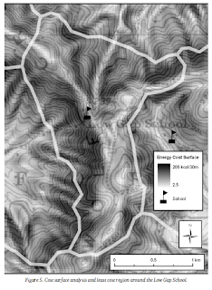
In terms of GIS mapping, NED elevation data was inputted as a raster layer of slope (% vertical rise / % horizontal run). Rivers were assigned a very high value (100,000 calories) to make them into barriers and the resulting zones were compared over various spatial characteristics such as building counts and density. Below is an example of the spatial characteristics around a Low Gap (least cost) School.

Including the hamlets, the map becomes even more comprehensive, as can be seen in Figure 6 below. Both Low Gap School and Ridge School are included.

Some of the results in chart form can be seen below.

Hopefully, studies like this can continue to other regions into the future. The study may be regarded as highly replicable, and the findings may be applied to regions ranging from the social sciences to historical geography.

Towers, George. "Rediscovering Rural Appalachian Communities With Historical GIS." Southeastern Geographer 50.1 (2010): 58-82. Academic Search Complete. Web. 20 Feb. 2012. <http://search.ebscohost.com/login.aspx?direct=true&db=a9h&AN=48811247&login.asp&site=ehost-live&scope=site>

Sunday, February 19, 2012

GIS teaching kids.

Maps can always be found at a school. They are rolled up and pulled down when needed but GIS maps are changing that.  National Geographic has maps that are sent to different schools to help teach children in a completely different way. They have designed maps that take up an entire gym floor. These maps are so large that they need to be laid out in a gym to be viewed. "Usually, when you talk about the scale of a map, you're talking about the ratio of distances on the map to distances in the real world. These days, however, when educators working with National Geographic maps talk about scale, they may be talking about how big the map is. For example, a teacher may have her students working on a map at the "scale" of a tabletop, a large wall, or even a basketball court."
two third graders explore South America
They have found that people of every age are attracted to the large size of the maps and can't help but walk around and study them. "So what's going on with all these big maps? Well, we've learned that kids find large maps to be magnetic. And not just young kids. Teens and adults find large maps irresistible as well." 
Photo: Students on Pacific Ocean Map
A map this large just begs it viewer to see how far something is from another point. "Most people find they can't just look at these maps. They must walk on them. They count how many steps it takes to get from Beijing to Moscow. They lie down to see if they can reach from the southern tip of India to the northern tip".
photo of students taking a break
Not only do the map's catch the interest of the viewers but the size allows for more detail to be placed on them. "Unlike regular-sized maps, you can see lots of detail and a large portion of the earth's surface at the same time. Similarly, you don't shift your eyes or turn the page if you want to look at a different location. You move your whole body, like you do in the real world. These maps allow people to interact with a map kinesthetically, experiencing scale and direction as physical sensation".
photo of students using MapMaker Kits
"In fact, some of the most engaging activities for these oversized maps are essentially low-tech versions of geospatial analyses. Have you ever represented a buffer with a hula hoop? Measured a linear distance in units of arm spans?"


http://www.esri.com/news/arcnews/spring11articles/scaling-up-classroom-maps.html

A side note:
I am also attaching the link to the National Geographic page with the information on renting the maps for schools.  I though this was cool so I forwarded it to my kids teacher. Something to consider if any of you are a parent with a school age kid yourself.

http://events.nationalgeographic.com/events/special-events/giant-traveling-maps/


Better fuel efficiency through GIS

"The University of California, Riverside, along with partners from several public and private organizations, have received a $1.2 million grant from the Department of Energy to research ways to increase fuel efficiency standards. As a project partner, Esri will provide its ArcGIS GIS software for mapping, navigation, routing, and vehicle tracking".


The research is being used to track the driving habits of people. They are trying to track how people drive so they can improve the way cars operate in relation to the way people use them. "The three-year project, named the Next-Generation Environmentally Friendly Driving Feedback Systems Research and Development, began October 1, 2011. It will establish comprehensive driver feedback technology that improves fuel efficiency of passenger cars and fleet vehicles."


Not only is the information being used help improve the design of cars but also improve navigation of people now. "The study will make large advances in developing a fully integrated information system that includes better trip planning and routing, improved efficiency while driving, and comprehensive reporting on a periodic basis." "ArcGIS is also being used by dispatchers for comparison of the planned routes with actual routes, mapping of ecofriendly vehicle paths, and mobile integration to update drivers with new itineraries."


All of the information that they are collecting is going to be provided to car manufactures so they will have a better outline of driver habits during car design. "The projects will help ensure that the technologies are available to help automakers achieve new fuel efficiency standards."


They are expecting gain's of 10 to 30% in fuel economy from the information collected, if used properly. "By integrating driver feedback technology, it is expected that overall fuel savings will range from 10 to 30 percent." 


http://www.esri.com/news/arcnews/winter1112articles/esri-partnership-to-improve_us-fuel-efficiency-standards.html

Before GIS: Water Supplies and the Western Front in WWI


7 August, 1916: soldiers of the British Wiltshire Regiment charge into no-man's-land during the Battle of the Somme.

Prior to the outbreak of World War I, advances in cartographic and land-surveying methods had elevated the profession to a position of significant military importance. The British Army was especially innovative in this regard, as they included the use of two dedicated military geologists to create water supply maps for subsequent operations against the German Army in northern France. These maps would prove to be invaluable to the field commanders of the British Expeditionary Force (BEF) who would be responsible for the adequate supplying of some 1.5 million soldiers and 500,000 service animals.

Before World War I, most military forces traditionally obtained their water supplies from both civilian wells and surface water sources like creeks, streams, lakes, and rivers. However, the massive armies used by the Great Powers in World War I necessitated that other water sources needed to be found as the war progressed. The intense fighting between Allied and Central Powers not only disrupted the general use of civilian water reserves, but also polluted other natural reserves with munitions, bodies, and human waste. This article “is focused exclusively on maps known to have been developed by military geologists, and thus on maps that relate primarily to groundwater occurrence.”

Between June 1915 and November 1918, both Lieutenant (and later Captain) W. B. R. King and his commanding officer, Lieutenant-Colonel T. W. Edgeworth David, served in the General Headquarters of the BEF on the Western Front developing water supply maps that gave accurate estimations of potable water sources in both Belgium and France. These maps were created on scales of 1: 100,000 feet, 1: 250,000 feet, and 1:40,000 feet that were to be used for advances past No-Man’s Land and into enemy territory. Estimating that each soldier and/or service animal required at least 10 gallons of water per day; the maps guided engineers to dig some 470 boreholes to supply soldiers serving in the trenches. From 1915 onwards, water supply maps were plotted by using detailed information such as the location of springs and their daily yield, as well as the location of pipelines and reservoirs where pumping stations were to be constructed. Specifics like daily supply rate, borehole capacity, depth, and yield were also used in the construction of these maps that were later converted into topographical maps for civilians in the regions affected.


1 : 250,000 scale map of available water sources in Belgium and northern France during the dry summer months.

Key to the above map.
Detail of a 1 : 100,000 foot map with key available.

The German Army also used military geologists, but in far greater numbers. A total of 300 geologists served with the Army, and they too were widely used to create standardized water supply maps that were usually scaled on the medium size of 1: 25,000 meters. Because of their numbers, they were organized under the Director of Military Survey in 1916 and each survey unit was tasked with creating maps for their respective sectors. By the end of 1918, the German attempt to standardize their maps was completed and led to more accurate mapping in geological structures later in World War II.
1 : 250,000 meter map for the German 4th Army.

In late 1917, when the United States entered the war, geologists were also deployed with the American Expeditionary Force (AEF) and created two versions of their water supply maps for their sector on the Western Front. Initially there had only been two surveyors accompanying the AEF, however by the end of hostilities in November 1918 there were nine in total, with six compiling and charting most of their work. Nine “geologic engineering maps” were created with one at 1: 80,000 feet for the high command, and eleven at 1: 50,000 feet for regimental officers.

Not only were the maps created in this time period used by the Allies for their final offensive that led to the Armistice in November 1918, they also provided much of the basis for the Royal Engineers textbook that would be used for later generations. The later publications of these declassified maps were later used by civilians in the inter-war period, and proved to be a successful foundation for furthered advances in hydrogeology during World War II.

Soldiers of the British Yorkshire Regiment moving up to the front during the Battle of Broodseinde.

Rose, Edward P. F. "Water Supply Maps for the Western Front (Belgium and Northern France) Developed by British, German and American Military Geologists during World War I: Pioneering Studies in Hydrogeology from Trench Warfare."Cartography Journal 46.2 (2009): 77-103. Print.

The Use of Environmental Features on Tactile Maps by Navigators Who Are Blind


The Use of Environmental Features on Tactile Maps by Navigators Who Are Blind
Amy Lobben and Megan Lawrence
University of Oregon


There exist over 100 standard symbols that the USGS (U.S. Geological Survey) include in their maps. For sighted users these maps facilitate map cognition, this understanding of the symbols allows more time spent in the understanding of the geography than the understanding of the symbols.Although this cannot be said for textual maps.

There are various obstacles with tactile maps, the most prominent ones would be the limited research in the area and that some of the technical factors that are straightforward in visual maps present some difficulties in tactile maps. Without the use of vision, blind people rely on other channels to gain the necessary information to travel; textual maps provide that. Tactile maps are linked to better spatial decisions making, environmental knowledge and independent travel.

Example of a tactile map.
Unlike vision-based maps research and financial support are not available for tactile mapping software, since it is unlikely to become a for-profit venture in the near future. Most tactile map makers are teachers, who are employed through special education programs. They rarely have training and limited resources from which to choose from. These teachers usually do not use Arcmap or Adobe Illustrator, but simply rely on a collage method, which is low cost and yields a single, non portable map. There exist attempts to use different software to be able to grow the availability for good quality tactile maps. Programs such as TAMP (Tactile Map Automated Production) which uses GIS technology and a graphic compatibility with Braille and TaME (Tactile Map Editor) which requires no previews cartography experience.


Another problem with Tactile mapping is the symbology used in the maps. Point symbols must be easy and large enough to interpret, and in different countries the symbols might vary, which means that without standardized symbols the user must memorize the symbols on each individual map.

To simplified Textual maps a survey was made from 144 participants which were blind, asking them to identify the symbols or areas that they believed to be most useful or important on maps. The image below represents the answeres: 


The conclusion in the study was the creation of the most accessible and affordable way to create tactile maps was to develop a symbol set by combining the most important environmental features with texture, while using a microcapsule paper. The standardization of the symbology for tactile maps is vital to enhancing the use and understanding of these maps.


Hannah


Saturday, February 18, 2012

Geology and Wine in West Texas

In the past few decades, West Texas has established itself as a region capable of producing high quality wines. In fact, 66% of all Texas vineyards are located in West Texas, which is also home to the state’s two largest wineries.

Officially recognized wine-growing regions are called American Viticultural Areas (AVAs) and are distinguished by certain geographic features. There are eight AVAs in Texas, and four of them are in West Texas: the Texas High Plains AVA, Escondido Valley AVA, Texas Davis Mountains AVA, and Mesilla Valley AVA.

A recent study has analyzed the winegrowing conditions of these four regions by developing a GIS model that contains datasets describing climate, topography, geology, and soil. The study obtained their data from a variety of databases. For the climatic and topographic characteristics, a digital elevation model showing temperature and precipitation was used. For the geologic information, the researchers used a Geologic Map of Texas from 1992. The researchers digitized the map, then georeferenced it in order to associate the map with its specific coordinates. The data on soil was taken from a database of geographically associated phases of soil series


Common features of all four AVAs include relatively high elevation, warm to hot growing-season temperatures, mild winter temperatures, and low annual precipitation. These conditions contribute to fruitfulness and the development of color and tannin, reduce the spread of fungal diseases, and provide little risk of freeze injury. The soils of the regions varied widely.

Researchers measured temperatures in growing degree-days, an index of heat accumulation. They used this measurement to compare harvest times with other regions. Wine grapes in High the High Plains and Davis Mountains AVAs are harvested in late August to early September, about 400 degree-days earlier than what is considered standard for most winegrowing regions of the world.

However, the Escondido Valley and Mesilla Valley AVAs are drier and warmer than the High Plains and Davis Mountains AVAs, resulting in fruit ripening earlier and thus earlier harvest times. Although some consider these conditions of the Escondido Valley and Mesilla Valley AVAs to be too hot for wine production, the EV AVA has a successful history of wine production.

The success of high quality wine production in West Texas was found to be a combination of favorable conditions and good vineyard soils as well as the producers’ choice to plant “climate-appropriate grapes cultivars,” i.e. grapes that can take the heat.


Geology and Wine 13. Geographic Information System Characterization of Four Appellations in West Texas, USA. Edward W. Hellman, Elvis A. Takow, Maria D. Tchakerian, and Robert N. Coulson. EBSCOhost

Mapping Unexploded Ordinance in Europe

An area being cleared after the discovery of a 2,500lb bomb in 1948.

Between the years 1939-1945, the Allies were estimated to have dropped 2,770,520 TONS of ordinance on the Axis Powers. In Italy alone, air raids by the RAF and the USAAF delivered approximately 1,000,000 bombs on Italy, 10% of which failed to explode on impact. In this article, a group of surveyors created a new GIS system that is purposed to mitigate the risk of civilians accidentally finding and triggering any remaining Unexploded Ordinance (UXO).

USAAF B-24 Liberators over PloieÅŸti.

As the article states, there were 32, 019 known bombs dropped on 271 targets in the province of Trento. 801 of these bombs had long-delay fuses, and constitute between 800-1200 UXOs still to be found. Unexploded munitions pose a great risk to all, and work projects have been delayed and entire areas evacuated due to the continued development of the region which has brought the civilian population closer to unmarked territory.

A conservative estimate of the amount of UXO buried in Italy is about 25,000 bombs, provided that 3/4s of that number have already been located and subsequently disposed of. The surveyors in this article were affiliated with the UXB-Trento Project, a GIS-based initiative known as the Geographical Information System GRASS. This technology is able to successfully detect craters and/or man-made depressions by using unclassified war archives, flight plans, and reconnaissance imagery to create accurate and detailed maps of the areas which are most at-risk for a UXO event. 

The group created this system by constructing a geo-spatial database with created from images, news reports, and debriefings. Precise bomb lists, coordinates of intended targets, mission descriptions, and results were all factored in the software’s development. The resultant risk map has been used repeatedly by the Civil Defense Department of Trento since its publication in 2001, and has been an effective tool in mitigating the risks of UXOs.

Source:
Mapping the Risk of Unexploded Bombs from World War Two
Cesare Furlanello, Stefano Merler, Stefano Menegon, Eva Paoli, Steno Fontanari
ITC-IRST, Trento

Friday, February 17, 2012

Site Selection Using Analytical Hierarchy Process by Geographical Information System for Sustainable Coastal Tourism

                Because a large number of tourists flock to areas in search of sun and sea, a feasible site-selection method for tourism based on supply and demand was created.  The area selected for case study was the coast of Guilan Province.  Traditionally recreation and coastal protection were of high concern in beach management, but ocean and coastal tourism is one of the fastest growing areas on tourism today.  Therefore, beach management will attempt to accommodate this purpose as the tourism industry requires a beach.  GIS is being used because it can choose an ideal selection based on several independent factors.

In order to select destinations of sustainable coastal tourism, 3 procedures were exercised:
1)      Using GIS to generate information layers to develop a digital database in which the spatial information is formed.
2)      Exercising GIS to analyze the layers to determine primary coastal tourism sites.
3)      Exercising GIS to analyze information to determine the priority of the sustainable coastal tourism destination.

Based on previous research finding, information was available in six parameters: topography, water source, distance from the fault, flora, fauna, and soil.  These items were weighted based on one and zero logic – the area was either considered good or bad.  The results from the application are sustainable coastal destinations and these areas will be ranked and classified in order of priority of different options.  Results came up with 15 sites that were candidate for a more detailed evaluation (shown below).


The competitiveness of a destination refers to its ability to compete effectively and profitably in the tourism marketplace while still able to be sustainable and maintain the quality of its physical, social, cultural, and environmental resources while competing in this marketplace.  According to the final weight of each criterion in combination with the candidate areas, the sites were categorized and are priority.  Now that the study has been conducted, the next step is to find out a suitable area for the tourism based on infrastructure, competitiveness and supply, socioeconomic, and land use/tourist facilities and service.  This proposed method may be used for site selection in other locations and sectors of the tourism industry.


Flood Risk Analysis in Informal Settlements of Cape Town

Many of the settlements in Cape Town are located on marginal and often poorly drained land.  Because of this, most of these settlements are prone to flooding after rainfall.  The current flood risk management techniques are not designed to support informal settlements, but this study sought to investigate that the previous method could use to improve the flood risk assessment.  During the period from 1996 and 2005, 290 flood-disasters happened in Africa alone which left 8,183 people dead and 23 million people affected, causing $1.9 billion economic losses.  Floods were the most frequent natural disaster in Africa during this period and the frequency of the disasters are expected to increase in the future.
                Risk is assessed by the following equation: Risk = Hazard x Exposure x Vulnerability.  Based on this equation, if any of the three elements increase or decrease then the risk increases or decreases respectively.  Studies into the level of vulnerability of an environment or community to a particular hazard will invariably provide insight into the magnitude of risk of the environment or the community to that hazard.  This study therefore adopted vulnerability as an indicator of risk: Regional Vulnerability = Damage potential + Coping capacity.  The study focused on assessing these prescribed factors in an informal settlement in Cape Town.
                Graveyard Pond is an informal settlement located in Philippi, a suburb of Cape Town.  This settlement is particularly prone to flooding because it is located in an area designated as a catchment pond.  As you can see in the picture, housing was built in the lowest part of the settlement.


                The magnitude of vulnerability is inversely proportional to the magnitude of the associated weight.  Weights were allocated to the individual households based on their responses to disasters experienced.  The weights for the hazards were then mapped along with the weights for sanitation and disease, and income, ultimately showing overall vulnerability by averaging out the weights.


                This study made the ranking significantly simpler by assessing all the alternatives at once rather than ranking them against each other.


http://www.sajg.org.za/index.php/sajg/article/viewFile/27/11

GIS and Pollution Model in Denmark

Researchers in Denmark created a computerized air pollution model in order to test whether it would be an acceptable tool for assessing the exposure of contaminants. They used a case study from Kolding, Denmark, which had reported three outlets of TCCD emission (tertrachlorodibenzo-p-dioxin), one of the reasons they chose this area was because TCCD is a major environmental carcinogen, causing many kinds of cancers. Using GIS software, they layered the computerized air pollution model and immersion concentrations to visualize more accurately which population was being exposed. Along with these layers, they added the addresses, statistics (dead/alive), migrations (whether the person had lived in the area since birth, or whether they had moved into the area later), and which cancers prevailed in the area. The researcher's chose to discard skin cancers in the data, because they wanted to focus on the cancers that caused more deaths.


The red dot in this figure represents the main source of dioxin emission (Aluminum plant, established in 1970). The green dots represent the addresses of the people in the study.


 After layering all the demographic data the researchers created 3 zones on the map, each zone indicating an area with greater dioxin exposure. These zones were used to aid the researchers in analyzing the development of cancer in the region.


The final layer was the cancer case layer, which is indicated in yellow in figure 3. This layer showed the researchers exactly which zone (zone 3) had the most outbreaks of cancer, due to TCCD exposure. The criteria for including individuals in the study were: whether they had moved into the zone during 1986-1998 and whether their cancer diagnosis was given 1 year or less after moving into the area.

Results from this study alerted Kolding, Denmark that they should be concerned with TCCD emission. In 2000, after determining that the aluminium plant was emitting far over the legal dosage of TCCD one can inhale without harm, scientists began injecting carbon and chalk in to the cooling process of the chimneys to reduce the emission of TCCD.

This use of modeling and GIS can be used generally for confined areas, focusing on emission of chemicals within geographical boundaries. The researchers suggested that this kind of intermingling of model and GIS would not be accurate for chemical emissions made by cars, or food related chemical emissions.

http://www.jstor.org.navigator.southwestern.edu:2048/stable/pdfplus/3838105.pdf?acceptTC=true
Isabella

Tuesday, February 14, 2012

Using GIS for Siting Farmers Markets

Although urbanization has diminished the role of farmers’ markets in food provision in favor of wholesale stores, there has been a recent resurgence of interest in farmers’ markets. Now that local food is perceived as a fresher and more sustainable option than food from grocery stores, there has been a drastic increase in the number of farmers’ markets in the U.S. since the 1990s.

However, it is not easy for everyone to shop at farmers’ markets. Because farmers on small and medium-sized farms have only a limited amount of time to spend away from the farm, the markets are usually held only once a week for only a few hours and sometimes at inconvenient locations. Thus, many people find that these time and distance constraints prevent them from shopping at farmers’ markets rather than supermarkets.

While there have been many recent studies on the accessibility of farmers’ markets, operating times have largely been ignored as an obstacle for people. Instead, accessibility is measured in only distance or travel time from home. However, a new model using GIS has recently been developed to aid that address both spatial and temporal restraints, determining the ideal location and time for farmers’ markets in a certain area.

Researchers classify markets into those that operate on weekdays or weekends, and whether they operate in the morning, afternoon, or evening. They also classify customers into working and nonworking, which has enormous influence on when and where customers might shop. The models adjust travel distances by the time of day which determines whether people make their shopping trips from home, work, or other locations.

It was tested in Tucson, Arizona, where there are established farmers markets that have recently been encountering problems due to low patronage. After applying the models, researchers used GIS to create a map of the solutions, shown in Figure 3. This solution allowed 10% less travel than a solution that does not consider the time component.

However, more study is necessary - gathering more information from customers concerning their travels may show that weekend markets are favored. Finally, the revolutionary idea of adding a temporal component to GIS models is widely applicable. This type of model could be very useful for siting all kinds of services such as public transportation, day care, or banks.


Tong D, et al., Locating farmers’ markets with an incorporation of spatio-temporal variation, Socio-Economic Planning Sciences (2011), doi:10.1016/j.seps.2011.07.002

Use of Geographic Information Systems (GIS) in Agriculture: A Bibliometric Analysis

One of the greatest uses of Geographic Information Systems (GIS) today is in the area of agriculture and farming. One important fallacy in the area of GIS use in agriculture is that GIS is only used as a tool for precision agriculture applications.

GIS entered the academic library in the mid-1990s by the efforts of the Association of Research Libraries Geographic Information System Literacy Project, which attempted to help librarians understand GIS software and data sources as well.

An agricultural professor who had worked on this ARL project was also a part of the project at the University of Illinois at Urbana-Champaign (UIUC) to compile a comprehensive base map of the state of Illinois. The professor wanted to make sure that the products of the project were not lost after they left, acknowledging that GIS use at the university wasn't terribly coordinated at the time.

The following questions were asked about GIS use in agriculture and also at UIUC:
  1. Within the discipline of agriculture, what GIS software is being used?
  2. What types of data sets are needed and available?
  3. Who are the users of GIS?
  4. At the university, who are the local users?
  5. What research is being done that incorporates GIS?
  6. What instruction is being done that incorporates GIS?
  7. Are there common software programs or data sets being used?

Two studies were crafted, the using the Current Contents database to explore GIS use as a whole in the institution, and the other to search for "Geographic Information Systems" and "GIS" in the CAB Abstracts database. These are bibliographic databases from 1995, 1996, 1997, 1998, 1999 and 2000.

Subject codes were drafted to categorize the articles (some articles fell into multiple subject codes as GIS use tends to be very interdisciplinary). 18 codes were used in the first study, and 30 in the second study. Results for the first study can be seen in the two tables below:

Although "Agriculture" holds its own category, it may be noted that agriculture itself spans many disciplines, and other subject codes like "Atmospheric Science" and "Geoscience" could broadly relate. Results from the second study can be seen below:

Clearly, GIS use in agriculture spans more than just precision agriculture. More study in the future, the author says, could be taken in the area of these interdisciplinary to further understand the connections between subject areas, and also in creating sub-codes for the codes with the most citations.

Source: Allen, Robert S. "Use Of Geographic Information Systems (GIS) In Agriculture: A Bibliometric Analysis." Quarterly Bulletin Of The International Association Of Agricultural Information Specialists 50.3/4 (2005): 129-132. Library Literature & Information Science Full Text (H.W. Wilson). Web. 14 Feb. 2012.

Monday, February 13, 2012

UNSING GEOGRAPHIC INFORMATION SYSTEM

By: ANA-MARIA TOMA

Building off of examples of other risk assessment GIS software such as ‘HAZUS (HAZards United States) used in the computational design of different disaster scenarios like earthquakes, floods and tornados’, ‘the Alquist –Priolo; has been developed in order to help the civil engineering companies and the people to find the closest earthquake fault to houses and construction sites’, as well as RADIUS(Risk Assessment tool for Diagnosis of Urban areas against Seismic disasters) and ASPELEA (Assessment of Seismic Potential in European Large Earthquake Areas). Romania uses a GIS program, NetSET (Network Spatial Editing Tool), designed to solve important problems from the local public administration and economic agencies. Specifically seismic emergencies, using data sets created for the specific area. Data sets are created from existing  geographic objects, then defining attributes about each object are accounted for and sorts the objects into four groups, depending on their degree of risk in case of an earthquake emergency: degree 1 (U1), degree 2 (U2), degree 3 (U3) and unknown degree.


This allows the software to visualize a path for firemen or medical teams to take in case of a seismic emergency using GIS. It allows for better response time, less risk to first responders, and management of situations in case of disasters.

Toma, A. (2010). UNSING GEOGRAPHIC INFORMATION SYSTEM VISUALISATION FOR THE SEISMIC RISK ASSESMENT OF THE ROMANIAN INFRASTRUCTURE. Bulletin Of The Polytechnic Institute Of Iasi - Construction & Architecture Section, (3), 31-38.

http://web.ebscohost.com/ehost/pdfviewer/pdfviewer?sid=4ccb21ad-0c45-410a-8ddc-1bbc78975ffc%40sessionmgr111&vid=8&hid=104

GIS Provides Decision Support to National Recreation Area Stakeholders

 Risks to Boston Harbor Islands Graphically Displayed

 
   Areas where habitats are affected by boat traffic  
          The Boson Harbor Islands National Recreation Area consist of 34 islands near the Greater Boston shoreline. The park has been designed to protect the islands through improved access, providing education, conserving, protecting, and managing the natural and cultural resources for public use and enjoyment. With the parks increasing popularity boat traffic increased causing wake effects, which began disturbing nesting habitats, shellfish beds, pollution, and water turbidity. Researchers used GIS to show people the effects of this higher traffic and better manage the decisions related to this area.
        
           Through the mapping of vulnerable areas in the park using GIS revealed environmental problems and specfic management problems/challenges. What was done first was mapping out areas with heavy boat traffic and it's effects on the surrounding areas. Once that was done with ArcGIS Spatial analysis researchers argued for the limitation of the amount of traffic in potentially sensitive and vulnerable areas. Layers were created to illustrate the relationships between problems surfacing through increase popluarity of the park. For example a layer to represent turbidity was used to show the disturbance it had on shoreline nesting. Later on researchers took all the layers created and used ArcGIS to display the potential problems that were surfacing and the potential danger it will have if increased traffic continues.
 Ferry paths and shipping routes
            With the help of researchers using GIS they were able to identify spatial patterns of ecological vulnerability to traffic in the islands and surrounding waters. This resulted in an interactive tool to reference to for decision makers and park managers when making boat routes and "no-go" areas for boats.


http://www.esri.com/news/arcnews/spring07articles/risks-to-boston-harbor.html


Jeff Romine