Sunday, January 29, 2012

A Study of the Effects of Climatic Parameters on Determining Land Areas for the Cultivation of Canola in Ardabil Province Using GIS

                Using GIS, Fariba Esfandyary of the University of Mohaghegh Ardabili in Ardabil, Iran did a study and found regions favorable for the cultivation of canola seeds in the Ardabil Province.  One of the most important factors affecting the quality and quantity of agricultural crops during the growth and reproductive stages is the regional climate.  Using different layers in the GIS model including rainfall throughout the growth period, frost, temperature, and sunshine hours, he found the least and best suitable regions of the area for cultivation of canola.
                Using the table of regional needs below, the effects of climatic elements and factors were used the determine regions conductive to canola cultivation in the Ardabil Province.  Canola needs a soil depth between 0 and 2.5cm, depending of the type of soil and plant.  Temperature also influences the environment and the humidity of the soil, which can help or hurt the canola plant’s production.  Canola is a product of cold temperature regions.  There are two types of canola plants: autumn and spring.  The autumn type requires 6-8 weeks of cold and when these conditions are met, the relative performance is increased.
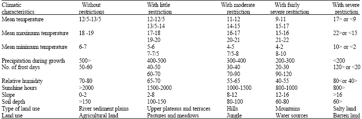
Table 1. Climatic needs of autumn canola in dry farming


                 Because canola requires less water it can be cultivated by two methods: dry farming and water farming.  It was found that the amount of water required for the cultivation of canola is between 210 and 550mm, depending on the air temperature and potential evaporation in dry regions.  Canola also requires a long day, its flowering is promoted as the length of the day increases.  Light is important and increases the growth of the vegetation.  Previous studies have proven that 2,000 hours of sunshine is not restricting for canola.
                To analyze the climatic elements, climatic-agricultural zonation of the province for canola cultivation was performed using GIS.  Various data was collected from the survey department of Jahad Agricultural Organization including: mean daily temperature, mean minimum absolute temperature, precipitation during growth period, mean maximum temperature, frost and sunshine hours from different synoptic stations, climatology, measurement of rainfall and evaporation, and physiographic factors such as topography, slopes, land use,  and soil depth.
                Climatic factors in combination are very influential in determining the climatic potential for canola cultivation in different regions of Ardabil Province, and it was determined that the overall amount of precipitation in most areas of the province and the distribution of the north west of the province as well as low temperatures and extreme frost in Bostan Abad and Sarab are the main restrictions to the cultivation of canola in Ardabil.
                Based on the climatic factors, suitable regions for the cultivation of canola were identified.  Although about 35% of the region studied may be conductive to canola cultivation, only about 10% of the region is favorable for canola cultivation without restrictions.
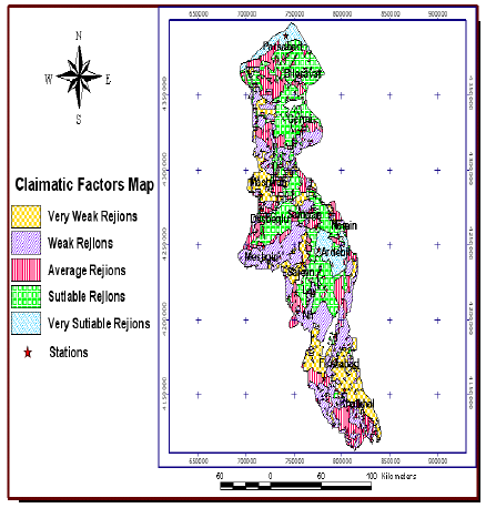
Figure 1. Suitable regions to cultivate canola in the Ardabil Province.


Health GIS and HIV/AIDS studies


As the number of people who have contracted HIV has gone from 33 million people worldwide in 2007 to a staggering 38.6 million in 2009 the research continues to find a way to slow the spread of this pandemic. GIS in the past has been used as a public health resource to map health events to the surrounding environment, existing health and social infrastructures. Given the first use of spatial referencing used as a health care tool by Dr. Snow to stop the spread of Cholera. It’s now proposed that existing GIS technology may be utilized in containing the spread of HIV/AIDS. “World Health Organization (WHO), United Nations Children’s Fund (UNCF), US Center for Diseases, United Nations Member States, and Public Health Agencies of different countries have been widely using GIS at large in epidemiology.”

The uses would include but not be limited to disease mapping (used to estimate the risk of a disease spreading across a geographical area), disease clustering (helps decide where it may be important to asses a disease map, as well as where clusters are located), and ecological analysis (analysis of distribution in relation to source, as well as ‘geo-applications’ – disaster prevention, early warning and emergency fields).

The racially fragmented city? Neighborhood Racial segregation and diversity jointly considered


Steven R. Holloway, University of Georgia.
Richard Wright, Dartmouth College
Mark Ellis, University of Washington.

The professional Geographer, forum and journal of the association of American Geographers.

    The Article talks about the racial configuration of urban space. The authors reflect that U.S. metropolitan neighborhoods are increasingly divided by race, where there still exist the ever-dominating white neighborhoods and the emerging Latino-dominated spaces.
    The scholars differentiate the neighborhood areas that are predominantly white (host society). These areas are divided into two categories, which depend on if the percentage of the area of whites is less or more than 80%. The remaining areas are later divided up based on their racial composition; 1. Where whites are the minority, 2. Where there is not a racial domination by a single group, and 3. Areas that are dominated by the minority, non-white.
     Their approach on studying these areas is not by analyzing racial mixing, but by studying "multiple types of segregation", placing the importance on the white population. Throughout  the study there was a great interest in neighborhoods with a stable mix of blacks and whites, since this seems to indicate that a mixed neighborhood  is not a result of "the white flight".

Neighborhoods are divided into two different sets, homogenous and  mixed:

Homogenous neighborhoods:
1.    Predominantly white: <80 percent white and no minority>10 percent.
2.    Predominantly black: >50 percent black and no other minority>10 percent.
3.    Predominantly other: >50 percent non black minority and <10 percent black.

Mixed neighborhoods have four subdivisions:
1.    Mixed white/other: 10-50% nonblack minority and ,10% black.
2.    Mixed white/black: 10-50% black and <10% nonblack minority.
3.    Mixed black/other: >10% black, >10% nonblack minority and <40% white.
4.    Mixed multi-ethnic: >10% black, >10% nonblack minority and >40% white.

    There have been other studies where all nonblack minority have been classified into one single group called "other", although this does seems to affect the data quite radically. Another study in 2000 has reported that 57% of mixed neighborhoods in 1970 have remained mixed throughout 1970-1990. A different study found that 80% of mixed-majority white neighborhoods in 1990 remained with the same mix in 2000.


Atlanta neighborhood classified by diversity and racial dominance, 1990 and 200.


Los Angeles Neighborhoods classified by diversity and racial dominance, 1990 and 200.


After analyzing this information we can conclude that the U.S. is becoming more diverse. The analysis confirms that segregations and diversity are not mirrors of each other. Once we have a full understanding of the difference in the homogenic and diverse neighborhoods we can start to question their origin, for example, how do age and income affect the diversity in each neighborhood?

Hannah Barrueta

Saturday, January 28, 2012

Disease maps as context for community mapping: a methodological approach for linking confidential health information with local geographical knowledge for community health research


Disease maps as context for community mapping: a methodological approach for linking confidential health information with local geographical knowledge for community health research

by Kirsten Beyer, Sara Comstock, Renea Seagren

Biological, social, and even economic reasons can be linked to certain health issues and concerns. Recently, people have started to approach health care and analysis through these various lenses, rather than only looking at the biological and physical aspects of human health. Beyer et al. used a multidimensional approach to gather both health data and community understanding about colorectal cancer in Storm Lake, an city in Iowa that has greater incidence and rates of colorectal cancer than the majority of Iowa.

GIS has been used to provide a deeper understanding of the spatial patterns for health hazards, exposures, and outcomes at different scales. This is contributed greatly to health researchers because they are beginning to analyze how patterns could be used for disease surveillance and identifying patterns between health outcomes and different causal factors. Researchers have run into some problems when trying to analyze health patterns because detailed health data, such as disease records, are extremely confidential.

The researchers chose to utilize community-based participatory research (CBPR) in their study because they wanted to involve their subjects in all phases of the research to better understand the community’s perspective. This approach would allow for the local knowledge of the community to be observed, which would better help with the development of health and education programs.

This particular study was aiming to connect confidential, geocoded health data with community generated information using GIS to advance research on colorectal cancer. Health data was obtained through the Iowa Cancer Registry and the Bureau of Vital Statistics. They had to be careful in their representation of the disease maps because they did not want any personal information to potentially be linked to particular households. The avoid this issue, they used adaptive spatial filtering that calculated a disease rate for each grid point on a map. A circular filter was used that expanded until enough data was include to calculate a stable rate.The filters varied in diameter according to the number of disease cases in the area and the areas in between the grid points were smoothed over using an inverse distance weighting function in order to produce a continuous representation of the spatial pattern. Since there were overlapping filters, the data was being repeatedly aggregated, which helped protect data confidentiality because geographic origin was made unclear.

Separate maps were created to display colorectal cancer incidence, late-stage, and mortality. These maps are shown below.


Once these maps were created, the participatory part of the research was then conducted. Seven focus groups were established and 12 interviews were conducted for a total of 60 participants. All the participants lived within a 20 mile radius of Storm Lake, a rural, northwestern Iowa in Buena Vista county. This county is characterized by poverty, low education, and designated as a medically under-served area.


The groups were participated in a presentation on colorectal cancer; a presentation about how researchers calculate disease rates and map them; a brainstorming discussion about why colorectal cancer is a greater problem in Storm Lake; and a mapping exercise where participants added features to a map that were thought to increase or decrease risk for colorectal cancer. The map to the right displays the community-generated features that the participants indicated as having a positive, negative, or unsure influence.


Overall, they found that that participants were concerned with environmental contamination, especially water quality, as a negative influence for cancer risks. Other features that were believed to be a negative influence were workplaces, fast food restaurants, poor quality housing, etc. Some of the features they believed to have a positive influence were associated with nutrition, physical activity, and healthcare. The map below was created displaying the community-generated features to visualize what/where people were perceiving influence to be located.


The community-based approach of the study allowed the researchers to gain a greater understanding of how the community members understand this particular health issue, allowing for more effective approaches to solving the problem. GIS was initially useful in determining areas that had the highest rates of colorectal cancer. Additionally, GIS proved to be a great resource of displaying information gathered from the participants. This spatial representation allowed both the participants and researchers to explain and analyze community understanding.


-Lisa Morse

source: Beyer, K., S. Comstock, and R. Seagren. 2010. Disease maps as context for context for community mapping: a methodological approach for linking confidential health information with local geographical knowledge for community health research. Journal of Community Health 35:635-644.

Thursday, January 26, 2012

Emergency Services Modeling

The key to successfully handling emergency situations is understanding the circumstances. GIS has become an integral tool in both preparing for emergencies (modeling things like hurricanes before they happen) and in responding to them (providing information like efficient evacuation routes). In the field of GIS, the "common operating procedure" has developed to encompass these functions.


Before GIS technology, the resource base for making critical decisions was limited to the experience of the person in charge of handling the situation. If this person lacked any specific knowledge in a crisis, there was no way to get that knowledge. Now, however, GIS can provide vast amounts of information to anyone trained to interpret it.

One of the challenges with using GIS technology in these settings is keeping them updated. In order to do this, government agencies and other organizations need to provide current regional foundational datasets. The development of this resource base has taken huge amounts of time and effort and is still in progress.

ArcGIS Online is a particular tool that can be accessed instantly because its data is stored "in the cloud", thus eliminating the need to download, process, and manage datasets with the geospatial information contained in GIS programs. Esri has a library of basemaps that can be incorporated into ArcGIS Online, and current-year demographic information can be found on the ArcGIS website. Additionally, ArcGIS Online hosts a community of other individuals that shares maps, services, layers, apps, and tools. Live feed data is available for dealing with real-time meteorological emergencies.


In 2010, Queensland, Australia suffered from intense flash-flooding. Emergency managers were able to set up a common operation procedure application in just 12 hours that provided them quick access to the latest and most accurate information. Alabama Marine Police were also able to make use of GIS data to respond to the Deepwater Horizon event in the Gulf of Mexico in 2010, applying biodirectional capability to the large-scale disaster.

Other programs are being developed and partnered with to make GIS technology accessible even to nonspecialists. Integration into Facebook, Twitter, Flickr, and Youtube through live incident response apps is becoming popular. The use of cloud computing and the interactive nature of ArcGIS Online has set the example for these programs.

http://www.esri.com/news/arcuser/0112/answering-emergency-management-information-needs.html

Before GIS: Operation Overlord and the Allied Invasion of Normandy


LSTs unloading supplies after initial D-Day landings.

Before the advent of GIS-based mapping systems, geologists, hydrologists, and cartographers worked tirelessly to create detailed and accurate maps of the world around them. The logistical and strategic importance of such charts were assuredly not lost on those within the military, as they could significantly affect the development of offensive and/or defensive operations during war-time.

France was the first to establish a national geological survey 1825, and the subsequent map it produced was published in 1840. This same map underwent two major revisions, the latest one being published in 1933, and was utilized by the US Army Corps of Engineers, in association with the US Geological Survey, to help generate terrain intelligence in 1943 for the upcoming invasion of Normandy. 

 The Allies used codenames in order to plan and execute specific military operations:
  • Operation Overlord (6 June – 25 August, 1944): 
          The Allied invasion of Europe; Overlord was in-effect from D-Day until the liberation of Paris.


H-Hour on D-Day, 6 June, 1944.

  • Operation Neptune (6 June – 30 June, 1944): 
          The assault phase of Overlord known as D-Day.

Soldiers of the 1st Infantry Division land at Omaha Beach.

  • Operation Cobra (25 July – 31 July, 1944):
          The breakout from the Normandy beachhead.

Detailed planning for Operation Overlord, the codename for the invasion of German-occupied France, began in earnest about one year before D-Day. Allied intelligence divided France itself into a grid, and from this grid, 1-inch-to-1-mile sheets were printed by the British Army for the regions of Languedoc, Provence, Corsica, as well as the northern France. Maps were also printed specifically for the area in-and-around Caen (Figure 6). This was done in order to assist the Royal Engineers’ Quarrying Companies who were to responsible for generating the immense amount of aggregate material needed to repair and construct roads, airfields, and hardened structures such as ammunition and vehicle depots once the Allies had established a beachhead.


The authors take special care to highlight the significant work done by the Geographical Section of the General Staff (GSGS) in World War II. The maps of the Normandy coast created by this group were able to indicate potential hazards to vehicles once ashore; recommend exits from the beaches that did not require demolition; suggest appropriate bombing methods to neutralize enemy beach defenses; direct engineers to sources of fresh water; provide detailed information on rivers and probable choke-points; identify areas from which to procure metal, sand, and gravel; and when expanded to include the whole of northwest Europe, advise USAAF/RAF officials on potential areas suitable for the construction of temporary airfields. The authors stress that fact that had it not been for these maps, the execution and success of the entire Allied campaign could have been derailed for years.

Beachhead established on D-Day +3.
 Work(s) Cited:
  • Rose, Edward P.F., Jonathan C. Clatworthy, and C. Paul Nathanail. "Specialist Maps Prepared by British Military Geologists for the D-Day Landings and Operations in Normandy, 1944." Cartographic Journal, The 43.2 (2006): 117-43. Print.

Tuesday, January 24, 2012

Geographic Information Systems used in Germany for water resources management


Advances in science and technology have allowed us to ensure that our drinking water is clean and safe. However, there are still around one billion people in the world today who do not benefit from these improvements, lacking access to clean and safe water. To address this disparity, the World Health Organization (WHO) has Water Safety Plans (WSP), which are used by water suppliers to systematically assess and manage risk.

A study was conducted in North Rhine-Westphalia, a western state in Germany, to use Geographic Information Systems (GIS) as a framework for implementing a WSP in the supply of groundwater. The aquifer studied supplied water for over 36,000 inhabitants of a German town, and water treatment merely consisted of reducing acidity and occasional chlorination.

The WSP was outlined in three steps, with GIS applied in each. In the first step, system assessment and design, data was collected about land use near the drainage basin and the identification of vulnerable populations in the distribution of water. There was intensive agriculture in the northern part of the watershed, raising the possibility of nitrate pollution from fertilizer. GIS techniques were used to map out the probability of pollution in different areas of the watershed as well as clusters of populations vulnerable to water pollution, such as schools and nursing homes.

The second step was to establish a monitoring system, in which spatial analysis techniques were used to measure the interaction of river water and groundwater by the amounts of chloride as well as nitrates. Researchers used an environmental risk index to determine safe levels of nitrates and chloride in the water, and then set “threshold values.” When the levels of nitrates or chloride in the water surpassed the threshold values, the water supplier would then implement corrective action, such as working with farmers to decrease pesticide use.

In the final step, management and communication, researchers used GIS techniques such as error mapping and cross validation to ensure that their measurements were accurate.

The study found that nitrate levels exceeded threshold values in the northern part of the watershed, the site of intensive agriculture. After implementing corrective action, the use of GIS in water management was found to be successful as researchers witnessed the decrease of nitrates in the groundwater (Figure 5).


Citation: Wienand, I, Nolting U, Kistemann T. Using Geographical Information Systems (GIS) as an instrument of water resources management: a case study from a GIS-based Water Safety Plan in Germany. Water Science & Technology [serial online]. October 2009;60(7):1691-1699. Available from Academic Search Complete, Ipswich, MA. Accessed January 21, 2012.

Monday, January 23, 2012

Simulating the East African wildebeest migration patterns


Migration of the African wildebeest has always been an unknown factor in the changes to the ecosystems of Serengeti- Mara African regions. Through the use of Geographic Information Systems (GIS) the tracking the travel of herds can be used to prevent disaster and allows for faster response to react when they inevitably do happen. By mapping the general needs of the herbivores, water and food- such as short grasses, as well as paths with the least resistance and other herd territories, yearly migration patterns emerge with  consideration to many factors including but not limited to: population explosions, drought, rain fall, climate change, and habitat degradation. Mapping also allows the tracking of many other effects of herd travel such as the turnover of nutrients, alterations of ecosystems- also effecting fauna and flora.

Before GIS much of the data was available but not able to be analyzed for use. Now in many places GIS is used as predictive models for the migration and habitat sustainability. These studies are able to mark the habitat locations and will allow prediction the migration routes taking in to account the vegetation and allowing the least amount of human-animal interaction.

The results of the tracking led to the knowledge of a migration pattern that follows the greener areas, the areas
that have the most water and therefore biomass for that time of year. First heading west then north along the edge of the park, moving further into the year, as predicted, the heard goes south, to avoid the rougher terrain while the females are pregnant. Also, allowing more access to sward grass which has more structural fiber. Then back up to their habit where most of the year is spent on the western border.

Article by:Douglas E. Musiega and Sanga-Ngoie Kazadi

A World Map of Agriculture

The “new” organic craze seems to be the latest fad, with people all over the world pledging against GMOs, buying local and scanning the ingredients sections of their purchases like hawks. Organic agriculture has actually been a budding source of scientific analysis since 1924 when Rudolf Stiner lead the first ever course in organic agriculture with 111 students in what is now the Polish village of Kobierzyce. The students, many of them farmers, came from six continental European countries.

The ideas presented in this course were refined and tested when his students established the Agricultural Experimental Circle of the General Anthroposophical Society. Several books appeared and the field has expanded ever since. Today, over 160 countries report statistics on organic agriculture, and the organics sector has an estimated value of $60 billion per annum.

Even more interesting, the use of maps to understand the world has expanded throughout the decades, becoming ever-more refined and encompassing.

In 1933, the Polish-American philosopher and scientist Alfred Korzbyski made a couple observations about maps. He stated that maps are not territories, and that the structural similarities of a map to a territory accounts for the usefulness of the map.

One of the most interesting mapmaking methods to capture usefulness may be the density-equalizing map, which gives each variable a space-related density. Starting with a map like the one below (Figure 1), a variable like organic agriculture may be introduced to result in a map like Figure 2.


The equal-density cartograms give a striking emphasis to certain parts of the map, with results where countries like Australia comparatively blow up and the entire continent of Africa seems to disappear.

Oscar Wilde claimed that "A map of the world that does not include Utopia is not worth even glancing at, for it leaves out the one country at which Humanity is always landing. And when Humanity lands there, it looks out, and, seeing a better country, sets sail. Progress is the realisation of Utopias.”

We may take his words to reflect upon the power that a map can tell us about looking to the future. With equal-density mapping, clarity abounds, and conclusions may be drawn. Maps give more than just territorial definition; they may in fact teach us about the individual experiments taking place every day as we sit down for lunch.


(by Kavita Singh)


Original article: A World Map of Organic Agriculture (2011) by John Paull and Benjamin Hennig in the European Journal of Social Sciences, 24 (3), pp. 360-369.

Danish Energy Company Focuses on Smart Grid


Danish Energy Company Focuses on Smart Grid
By Rune Homann

Dong Energy is a leading energy group in Northern Europe located in Denmark. Their mission is to create energy in a cleaner way for the environment, as they produce energy for over a million people.  Through the use of a smart grid they plan on reducing  the CO2 emissions by putting wind turbines in locations that will produce the most energy. With people wanting the planet to go green DONG Energy wants to establish themselves as a dominate energy company while not negatively effecting the climate.

In order for that vision to be brought to life they went to geospatial technologies and employed ArcGIS to evaluate the company’s network of customers and where the most energy is needed and pin point where energy is not at any given moment. Through the awareness and access of updated data on electrical output in the network grid by using GIS they can begin estimating how much power will be needed in the future annually.
  
With GIS advancing company’s like DONG Energy are more than willing to use the systems, as they were reluctant before because it took awhile to analyze the data, which was time they didn’t have. Now GIS has become faster and more efficient, so company’s can generate data more quickly and come up with solutions to their problems. For example Carbon emissions that energy companies are now dealing with.
Now that DONG Energy has established a smart grid for it’s network they can now map out places that will benefit the most when deciding where to put electrical charges for the growing industry of electric cars. Through the use of energy being generated by wind power they can send that energy to where it’s needed at that moment to ensure that the energy is being used efficiently and that all the costomers are being supplied a reliable amount of energy. Another problem that has been solved by GIS data is the replacement of copper cables underground that would have be a huge cost to the company and now they can see where and when certain copper cables need to be replaced.

GIS has a tremendous value to companies like DONG Energy and is becoming increasing important to understand and analyze the data, as it will and can save money, time, research, and probably most of all the state of the environment.

Jeff Romine